01
Brand clarity + identity
Positioning, messaging, visual identity, and brand guidelines that make your business feel established and recognizable.
Strategy · Naming support · Logos · Brand systemsCreative partner for growing businesses
I help small businesses turn good ideas into clear brands, persuasive websites, and marketing creative built to move customers.
Selected work Brand · Digital · Campaigns
Creative services · Built around your next move
You don’t need more decoration. You need a clearer story, a stronger first impression, and practical tools that help people choose you.
Positioning, messaging, visual identity, and brand guidelines that make your business feel established and recognizable.
Strategy · Naming support · Logos · Brand systemsFocused digital experiences that explain your value quickly, build trust, and guide visitors toward contacting or buying from you.
UX/UI · Conversion strategy · Responsive design · CROA cohesive campaign idea carried across the channels your customers actually see—from ads and email to social and print.
Creative direction · Ads · Email · Social · PrintScalable packaging and marketing systems that keep your brand consistent while making future creative faster to produce.
Packaging · Templates · Toolkits · Production systemsNot sure what you need? Start with the business problem. I’ll help define the right creative scope.
Discuss your project ↗Selected archive · Full case studies
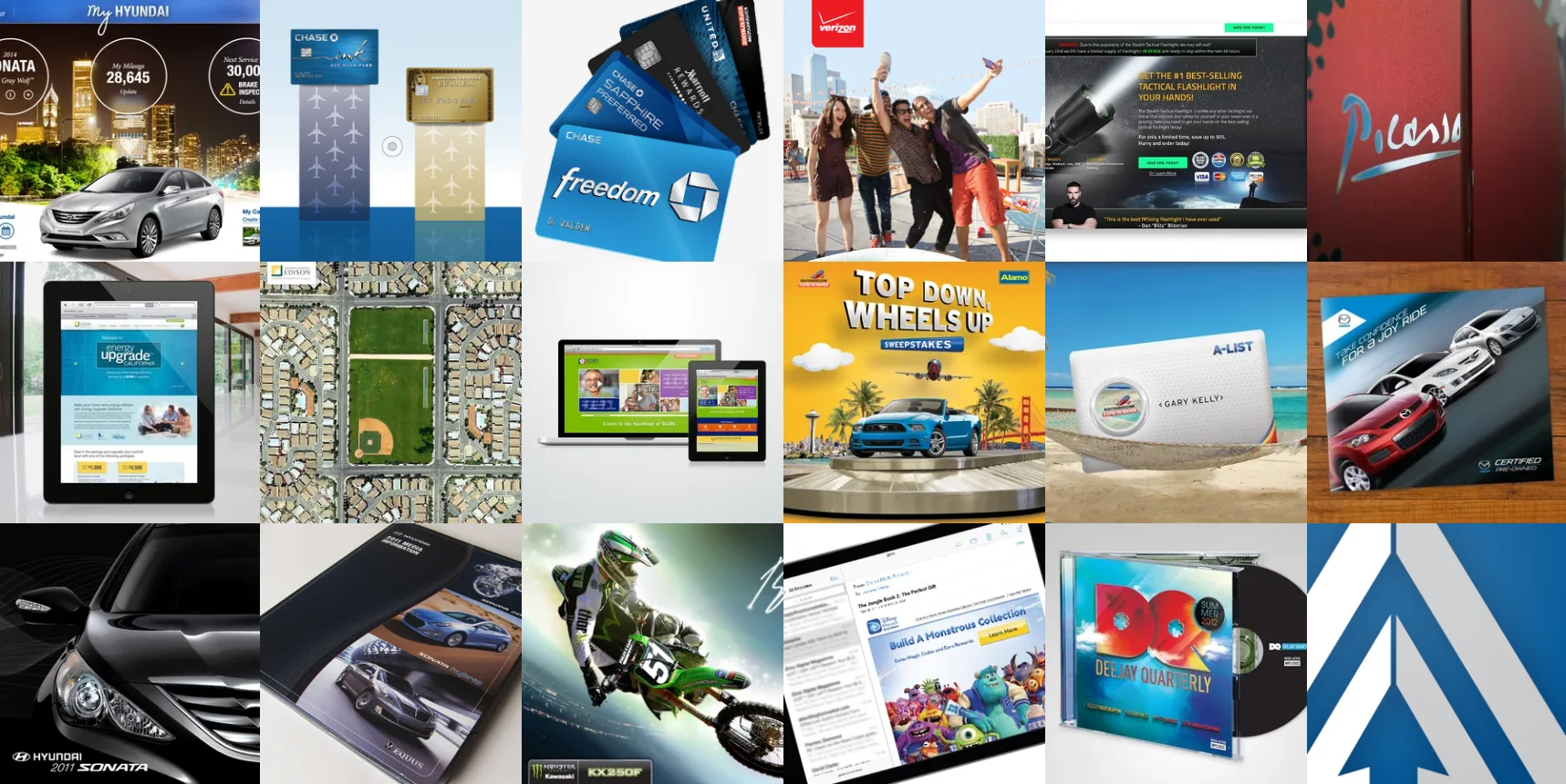
Start with a quick project overview, then open any case study to see the problem, approach, solution, outcome, and complete image set.
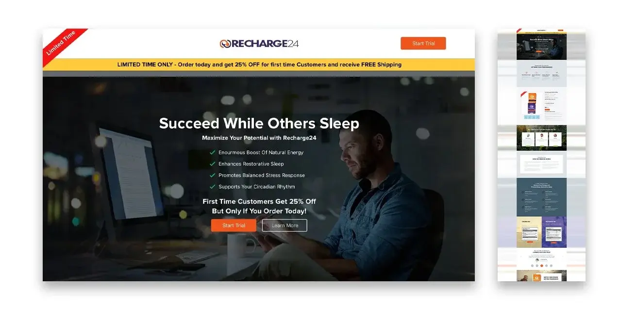
Wellness + Consumer Products
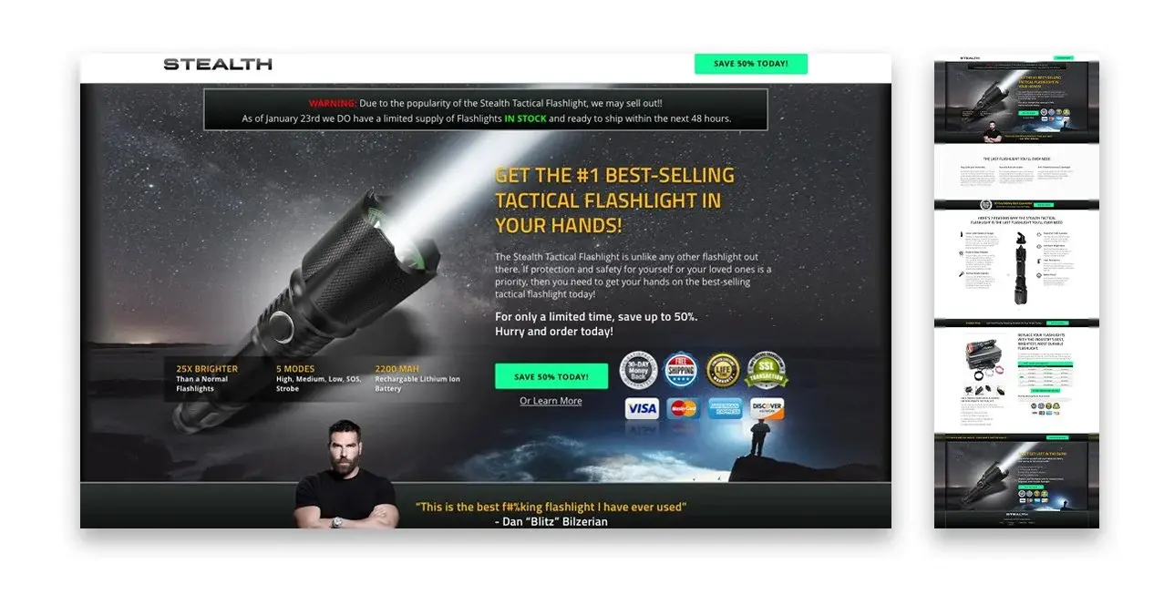
A collection of conversion-focused landing pages created for digital marketing campaigns with different audiences, offers, and acquisition goals.
Multiple campaigns needed dedicated landing pages that could convert traffic efficiently—each with a different audience, offer, and goal, but all requiring fast turnaround and consistent quality.
Focused on the fundamentals: a clear value proposition above the fold, visual hierarchy guiding attention toward the CTA, and minimal friction throughout the conversion path.
A systematic set of conversion-optimized page templates that could be adapted quickly to each campaign while maintaining visual quality and message clarity.
Reusable landing-page systems that connected acquisition creative to focused, persuasive on-site experiences.

Performance Marketing Brands
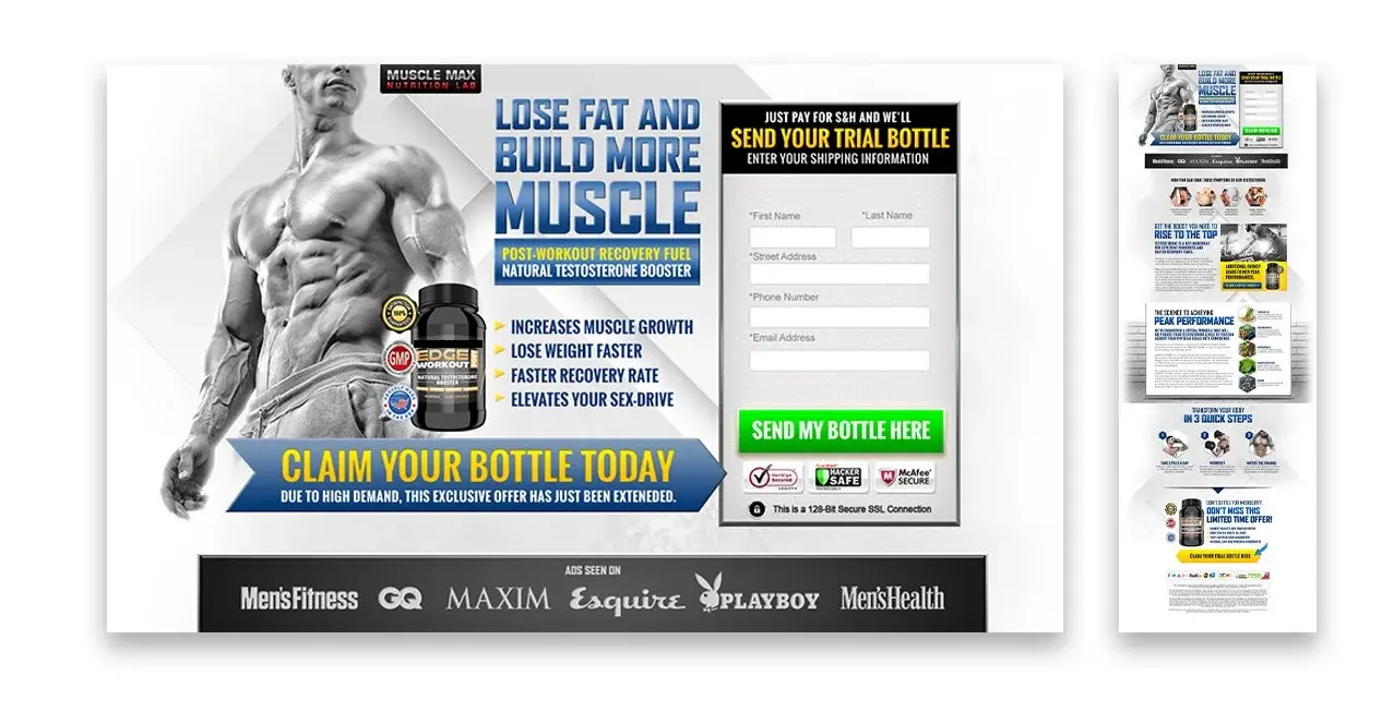
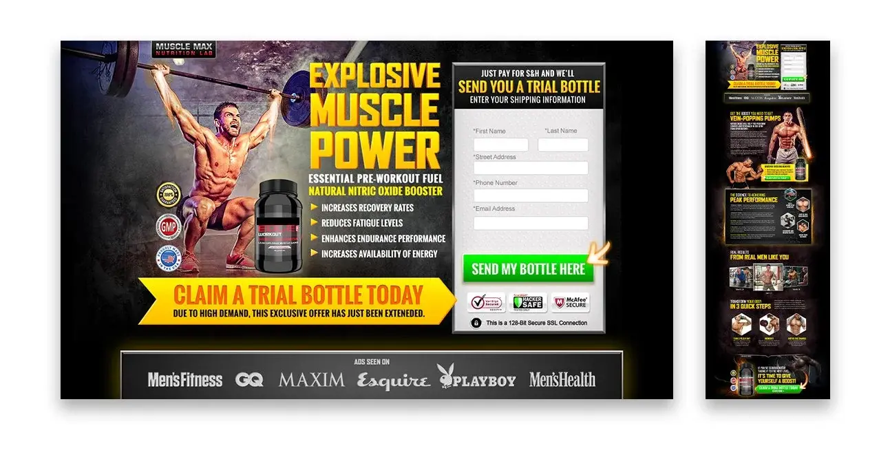
Scalable brand and production systems supporting hundreds of skincare and nutraceutical brands—connecting packaging craft with CRO, CRM, and performance-marketing insight.
A high-volume performance marketing operation needed distinctive packaging and product creative for hundreds of brands without sacrificing speed, consistency, or conversion focus.
Built modular design systems for labels and product imagery, established repeatable production workflows, and partnered across creative, CRM, and campaign teams to prioritize high-impact work.
A scalable system for developing packaging, product renders, ads, landing pages, and lifecycle campaign assets—paired with structured A/B testing across the customer journey.
Supported faster creative development at portfolio scale while using conversion-rate and CPA signals to guide iteration, improve campaign performance, and inform the next round of tests.
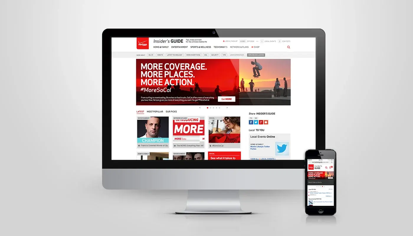
Verizon Wireless
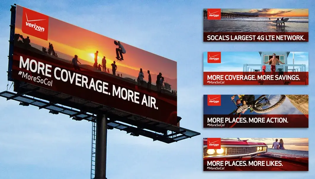
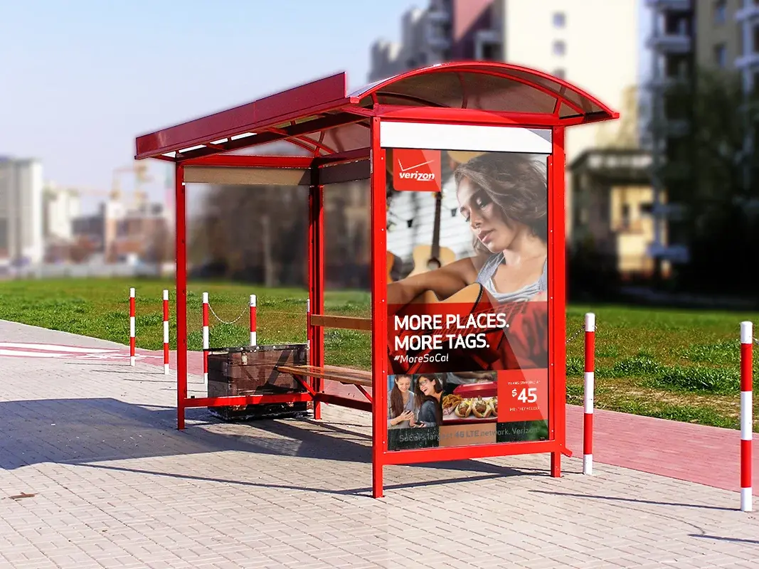
A fully integrated Southern California campaign spanning digital banners, billboards, bus shelters, and a social-content microsite.
Verizon faced aggressive price-based competition in Southern California and needed a market-specific campaign that created value beyond price alone.
Worked collaboratively across teams, leading the online banner execution as the digital entry point into a broader regional campaign and social experience.
An integrated system across banners, OOH, transit, and a MoreSoCal microsite that aggregated posts using #MoreSoCal to turn paid touchpoints into community participation.
A cohesive presence across digital and physical media, with the social microsite extending campaign participation beyond paid placements.
Hyundai
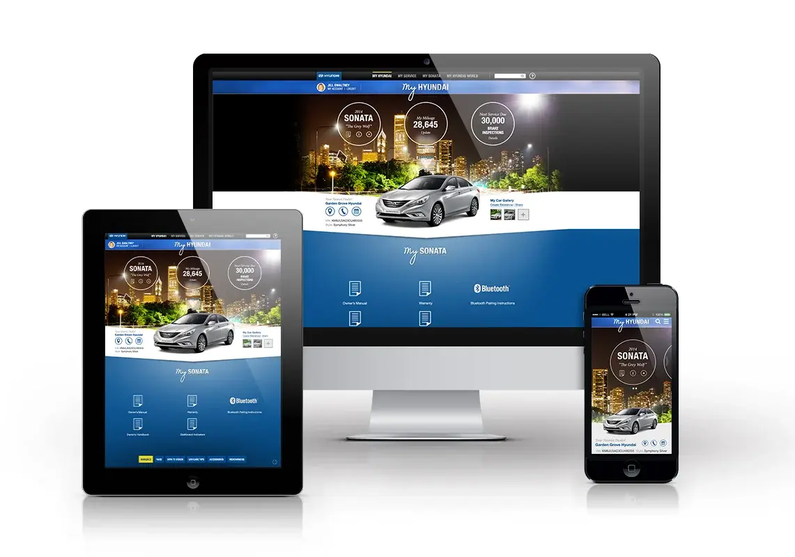
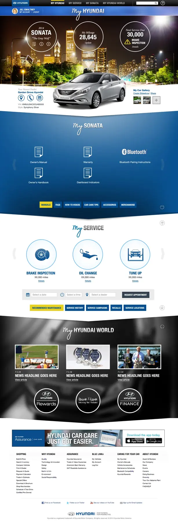
A one-page concept redesign of Hyundai's Owner Website built around a less-is-more principle—one focused section at a time, without distractions.
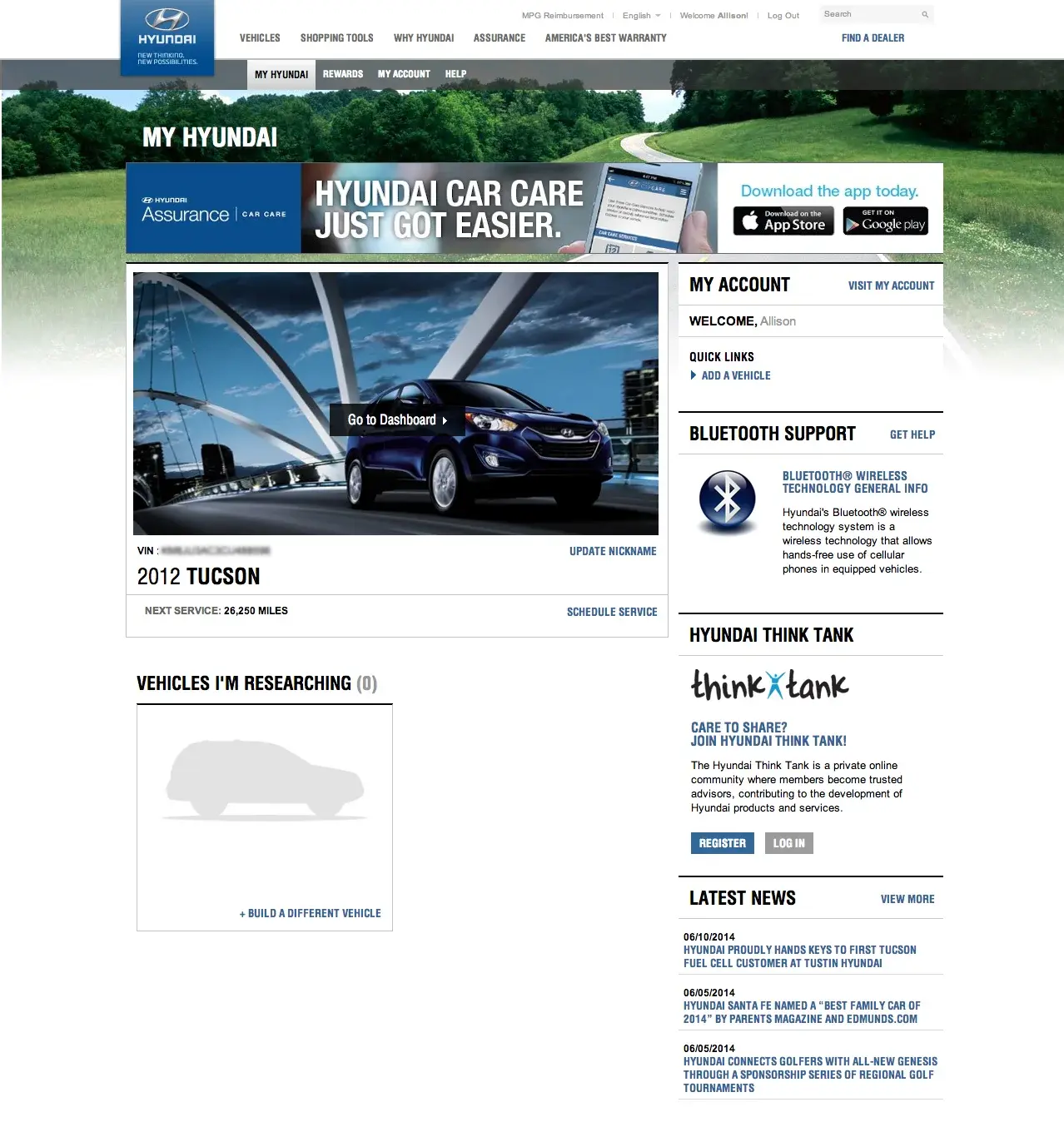
The existing Owner Website had a dated, cluttered layout that placed too much information on one page. Navigation required multiple clicks, and the experience was not responsive across devices.
Studied one-page patterns used in apps and games, then designed responsively around progressive disclosure so each section earns attention before the next appears.
A scrolling experience with sliding content and section navigation that reduces page count and clicks while supporting profile customization, slideshows, social integration, and sharing.
The concept demonstrated how a simplified single-page experience could reduce bandwidth, decrease navigation friction, and encourage owners to personalize MyHyundai.com.
Mazda
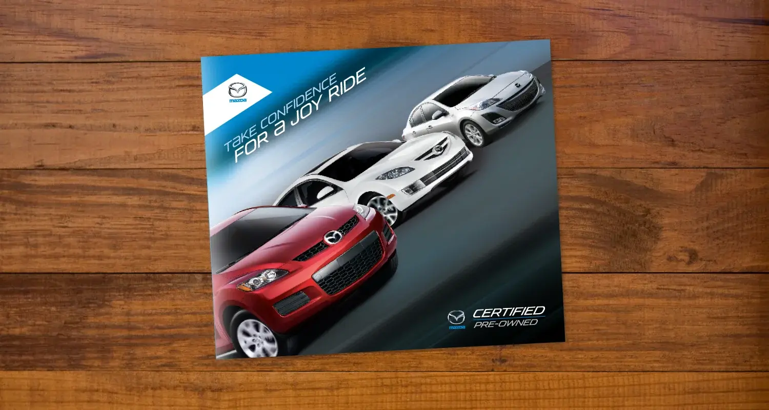
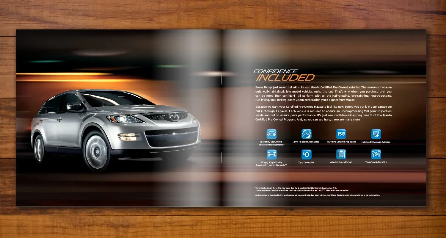
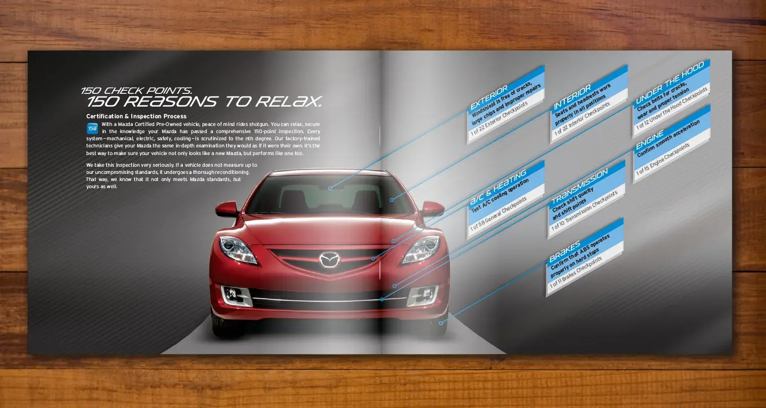
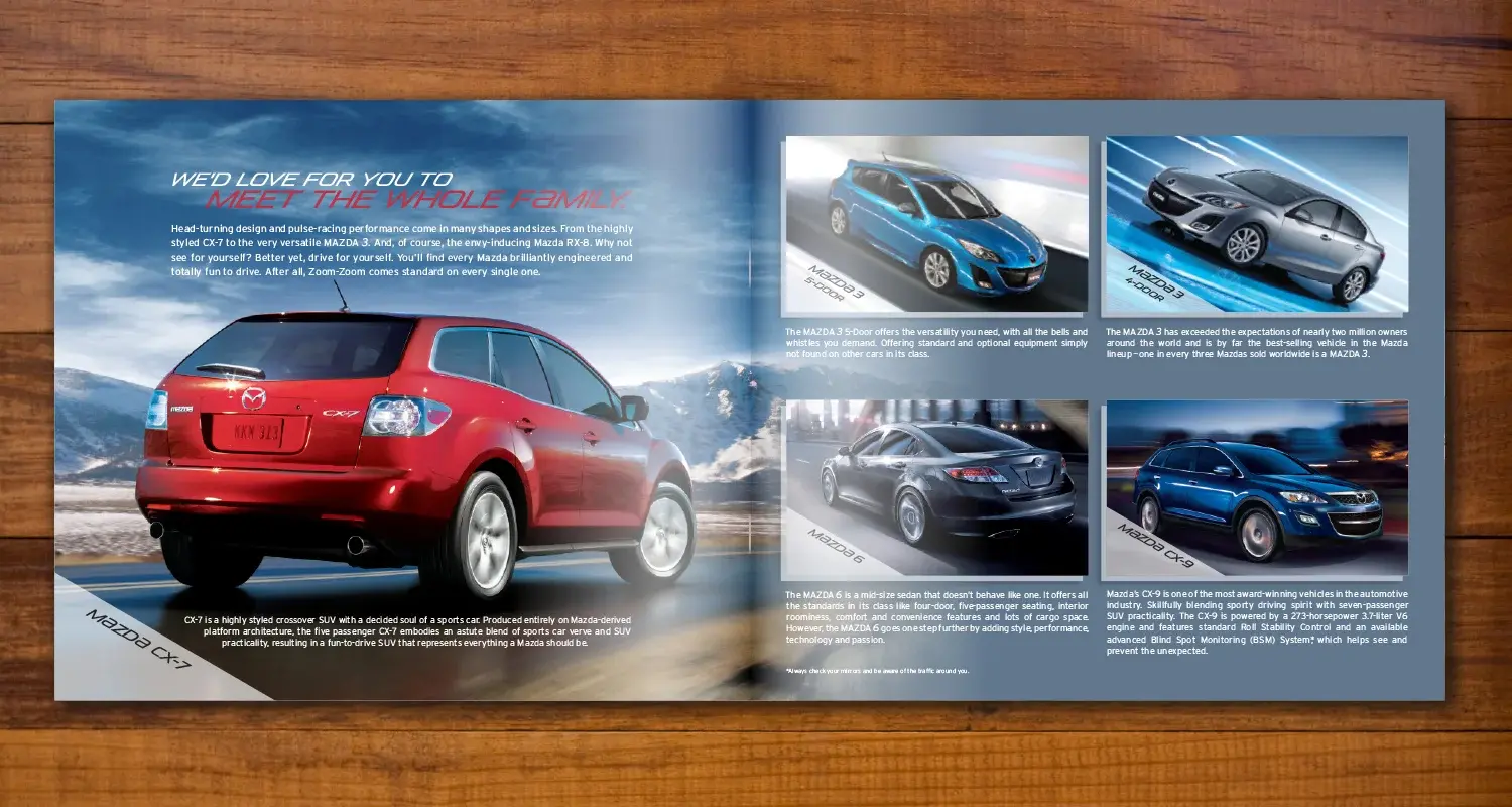
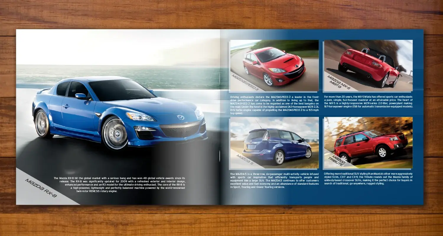
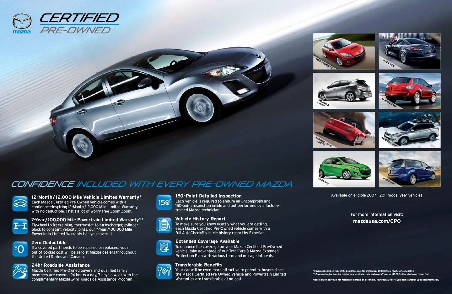
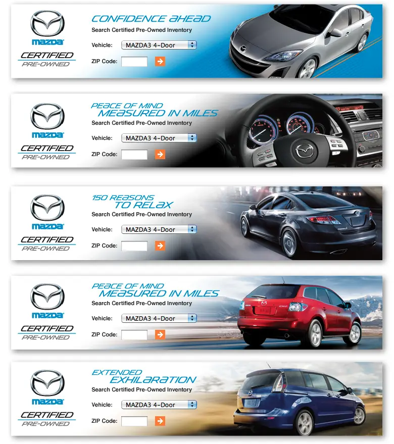
A ground-up repositioning of Mazda's Certified Pre-Owned program connecting customer messaging, dealer adoption, retail environments, and digital execution.
Mazda needed to reverse underperformance in its Certified Pre-Owned division and give customers and dealers a stronger reason to engage.
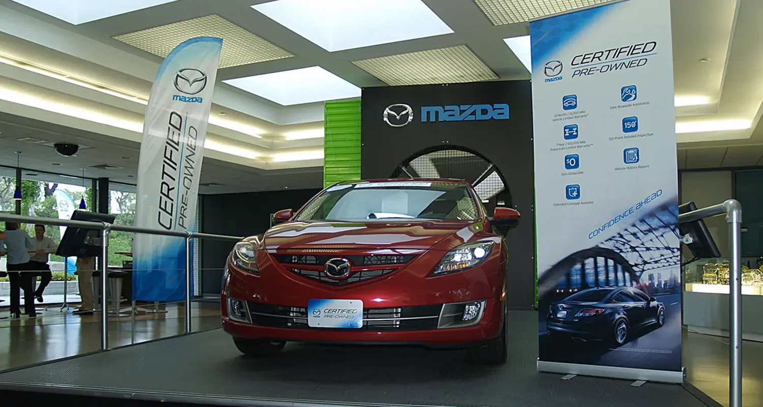
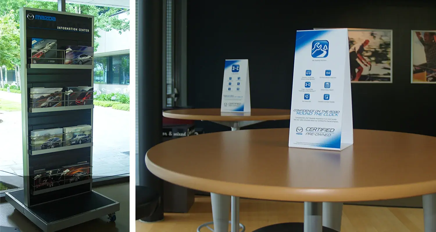
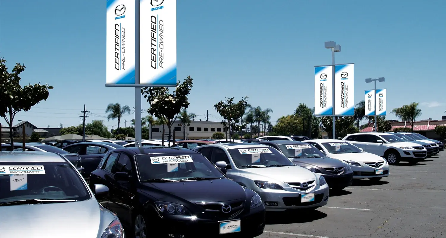
Rebrand the program from the ground up, aligning customer messaging, dealer adoption, retail environments, events, and digital touchpoints around one scalable system.
An integrated CPO platform spanning brochures, auto-show collateral, dealer materials, retail environments, and website banners.
The launch delivered Mazda’s best-ever month for CPO sales, enrolled dealers, active dealers, and certified inventory.
Business impact following the rebrand and integrated rollout.
Southern California Edison
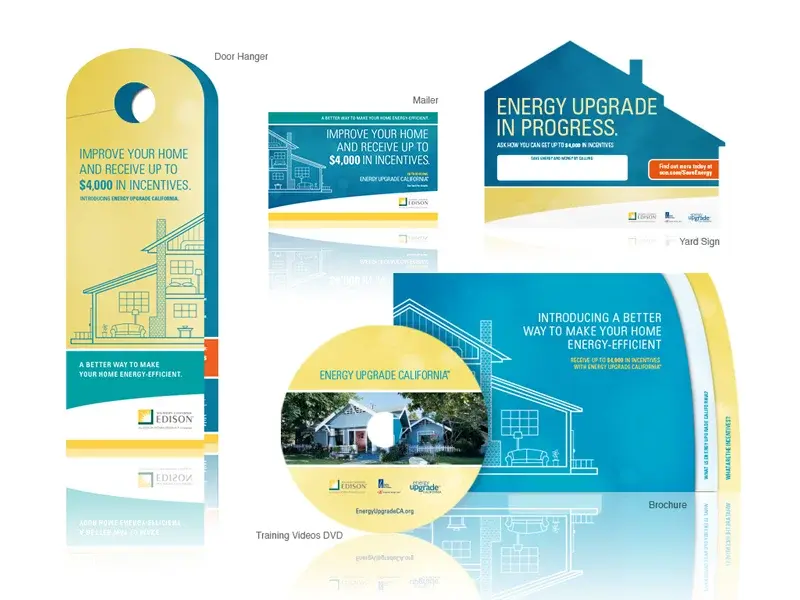
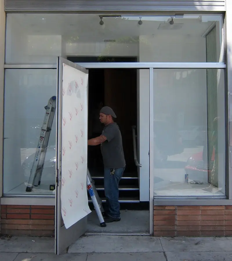
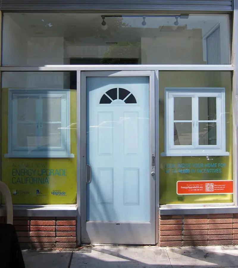
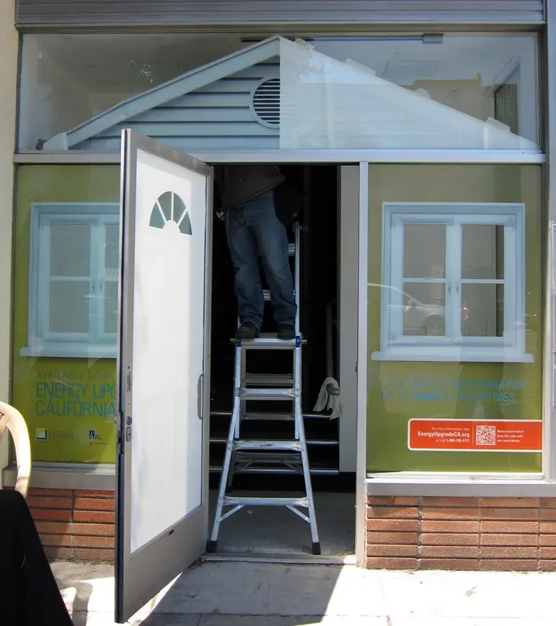
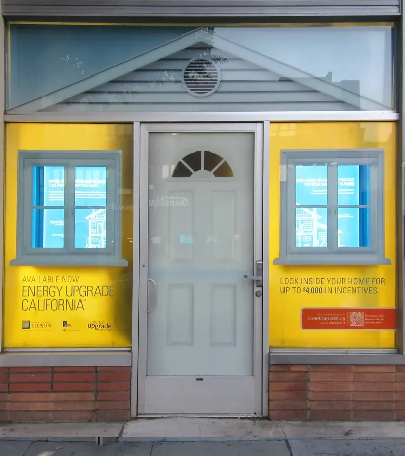
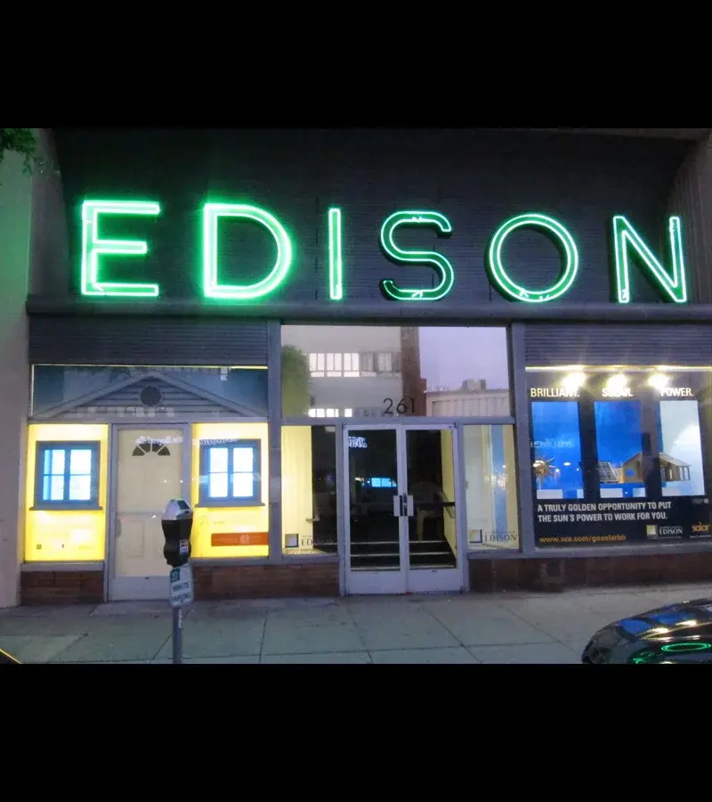
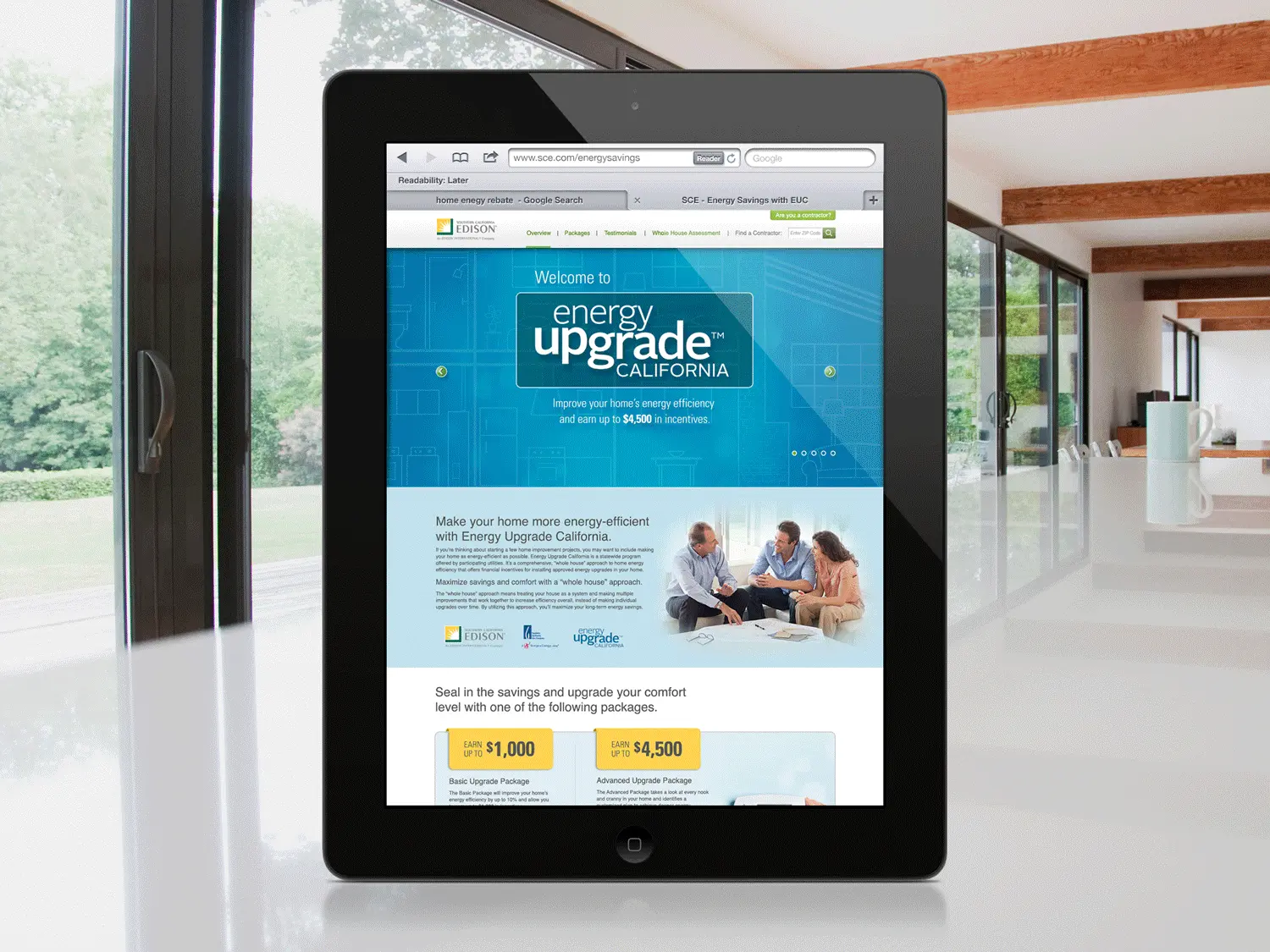
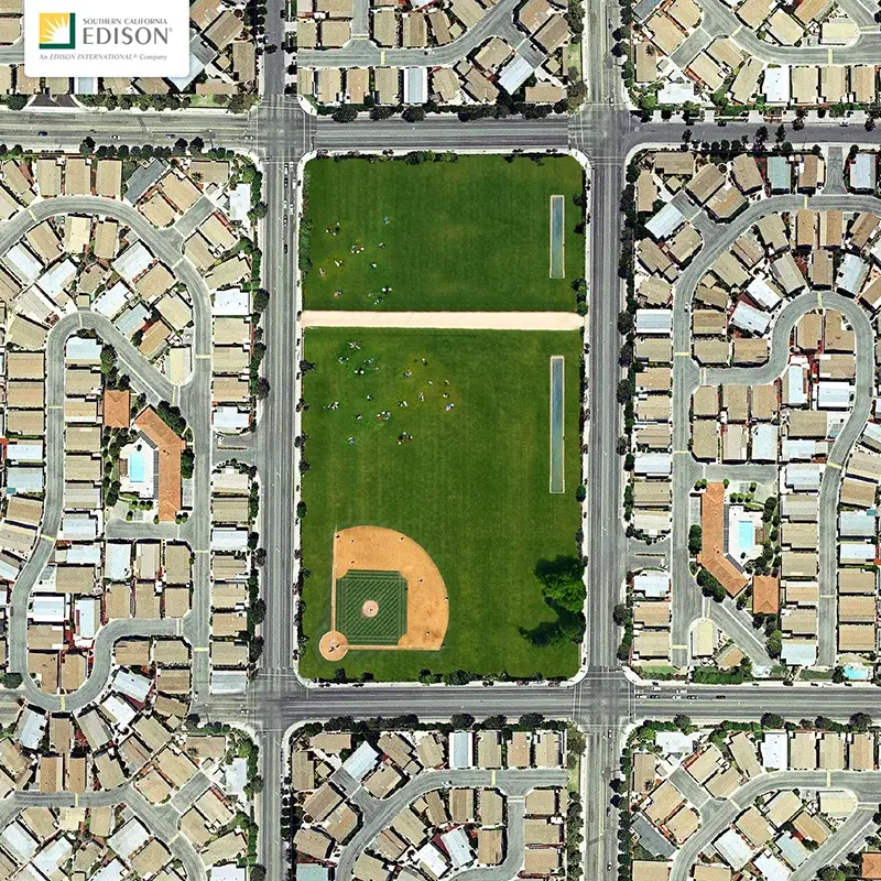
A multichannel awareness campaign for state energy rebates—microsite, direct mail, testimonial films, contractor materials, door hangers, and a Beverly Hills window installation.
High home-improvement costs made residents hesitant to participate, even with a valuable state energy rebate available.
Translate a complex utility program into a human story, coordinating direct, out-of-home, digital, contractor, and testimonial touchpoints.
An integrated awareness platform spanning a microsite, direct mail, educational and testimonial videos, contractor kits, door hangers, brochures, signage, window displays, and banners.
The collaborative campaign exceeded the client’s consumer-reach expectations while giving contractors a clearer toolset for program education.
Testimonial content gave contractors a credible, human way to explain the program and its benefits.
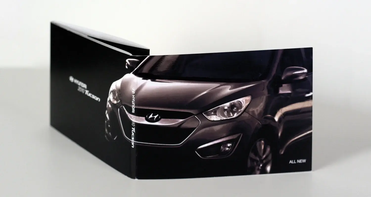
Hyundai
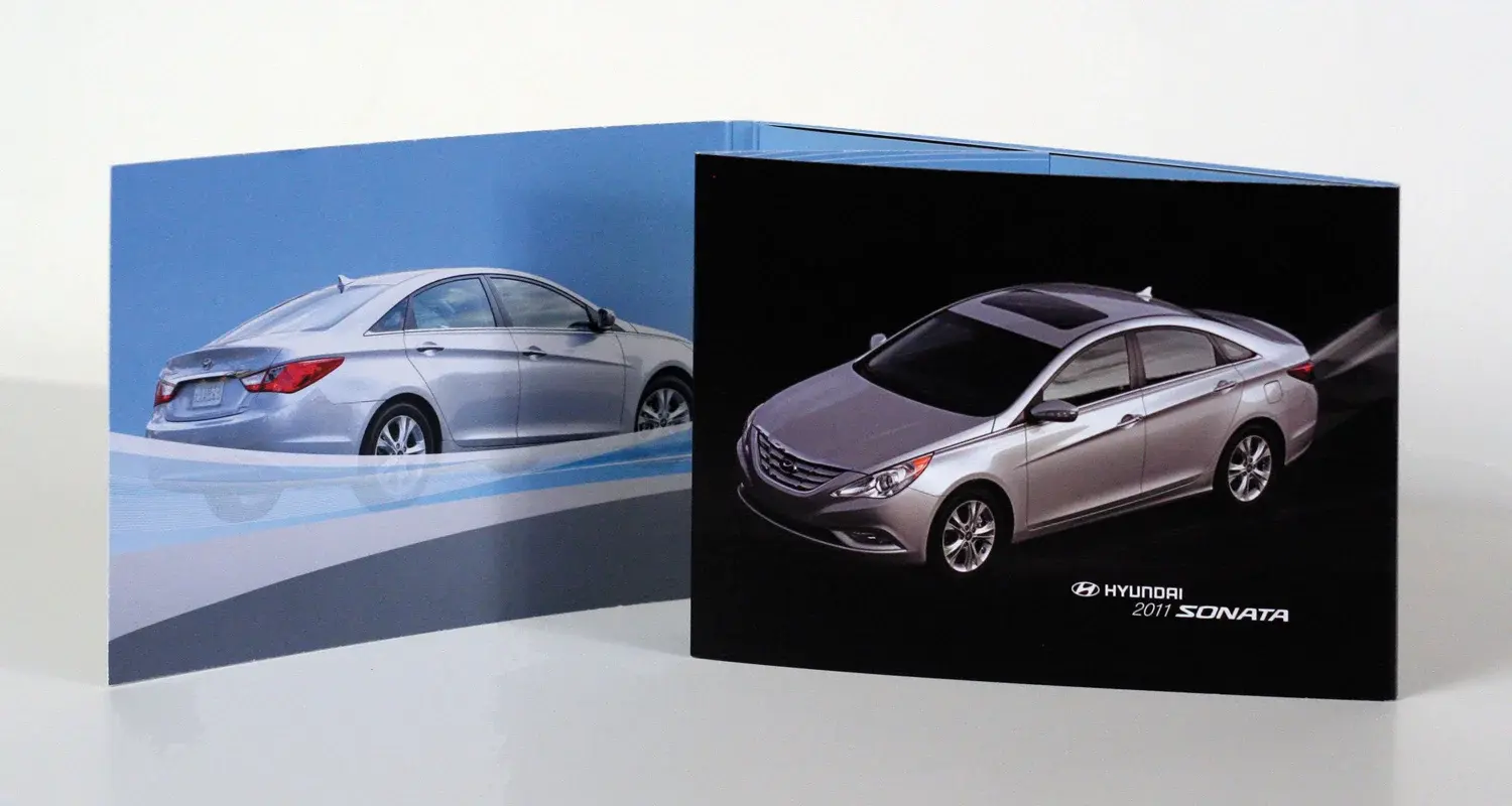
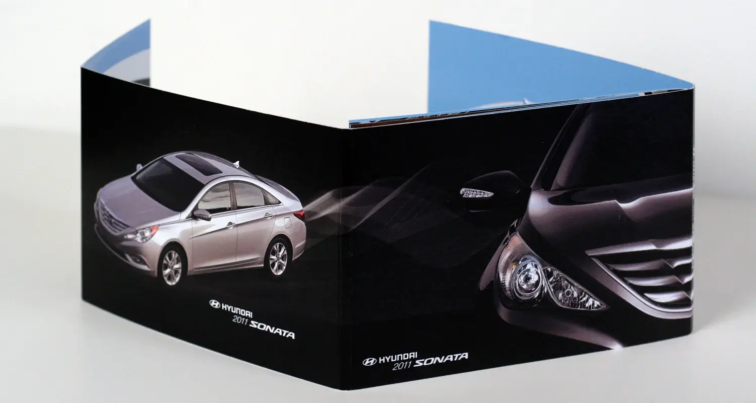
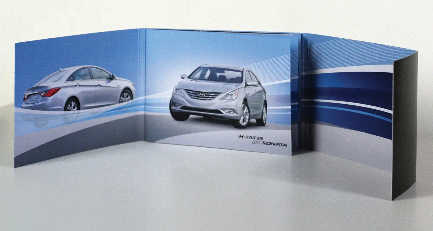
Premium editorial and packaging systems that translated dense vehicle information into distinctive launch materials for automotive media.
New vehicle launches needed press materials that made technical information feel premium and newsworthy.
Use editorial pacing, vehicle-specific visual cues, and tactile presentation to elevate the information experience.
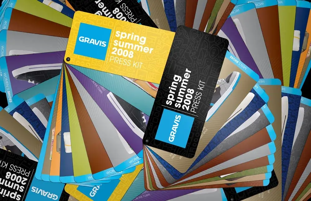
A series of launch press kits for Tucson and Sonata with coordinated exterior and interior systems.
Distinctive launch materials that organized dense content while reinforcing each vehicle’s identity.
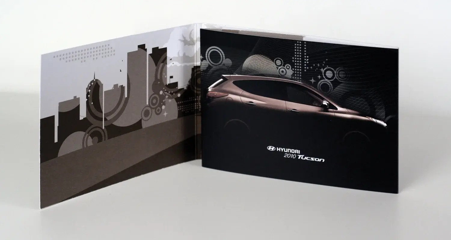
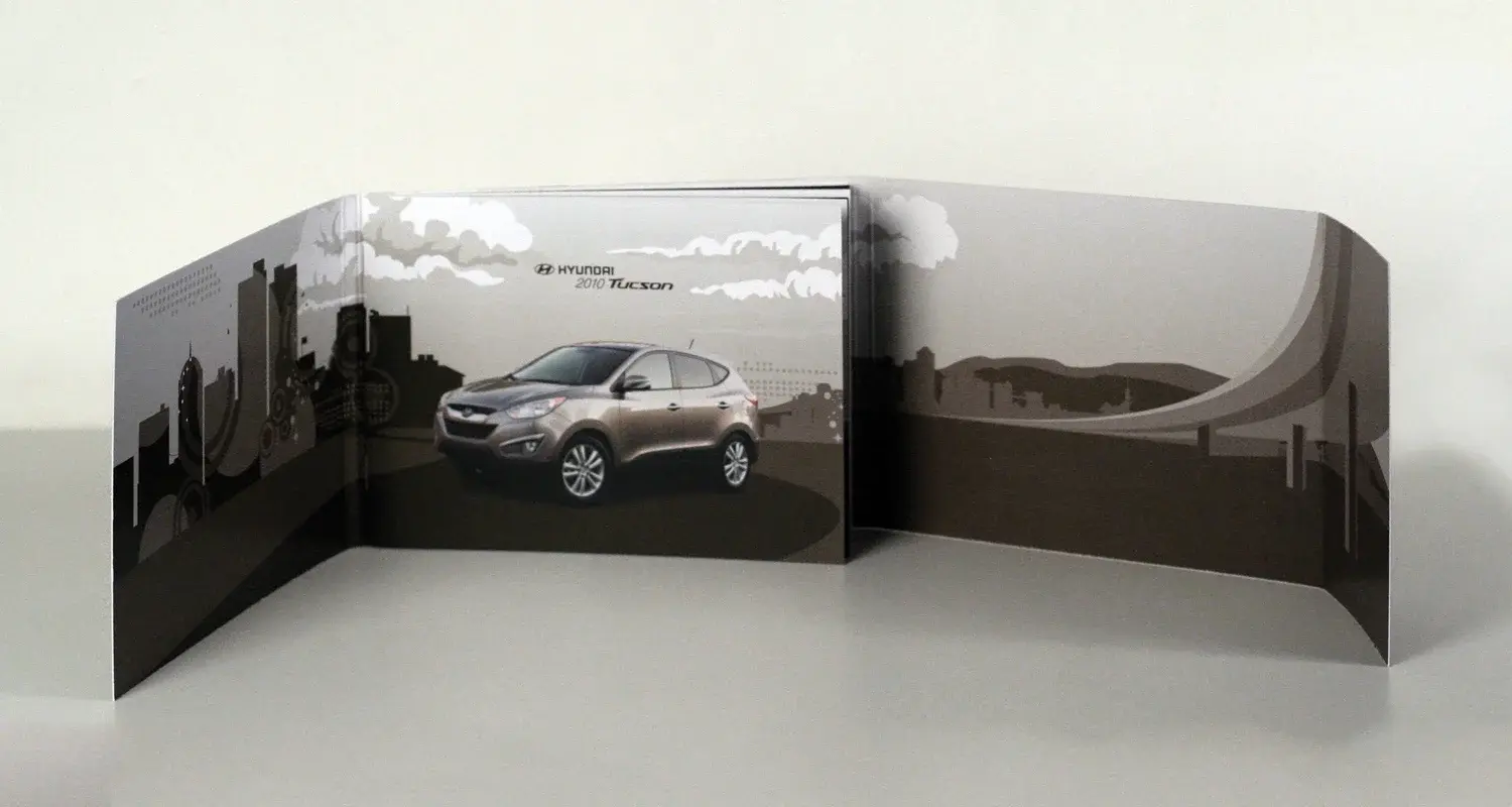
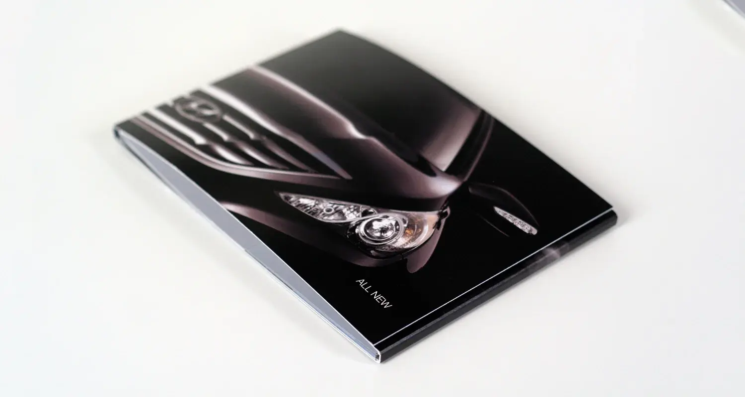
Hyundai
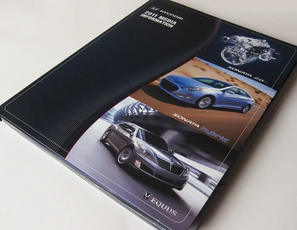
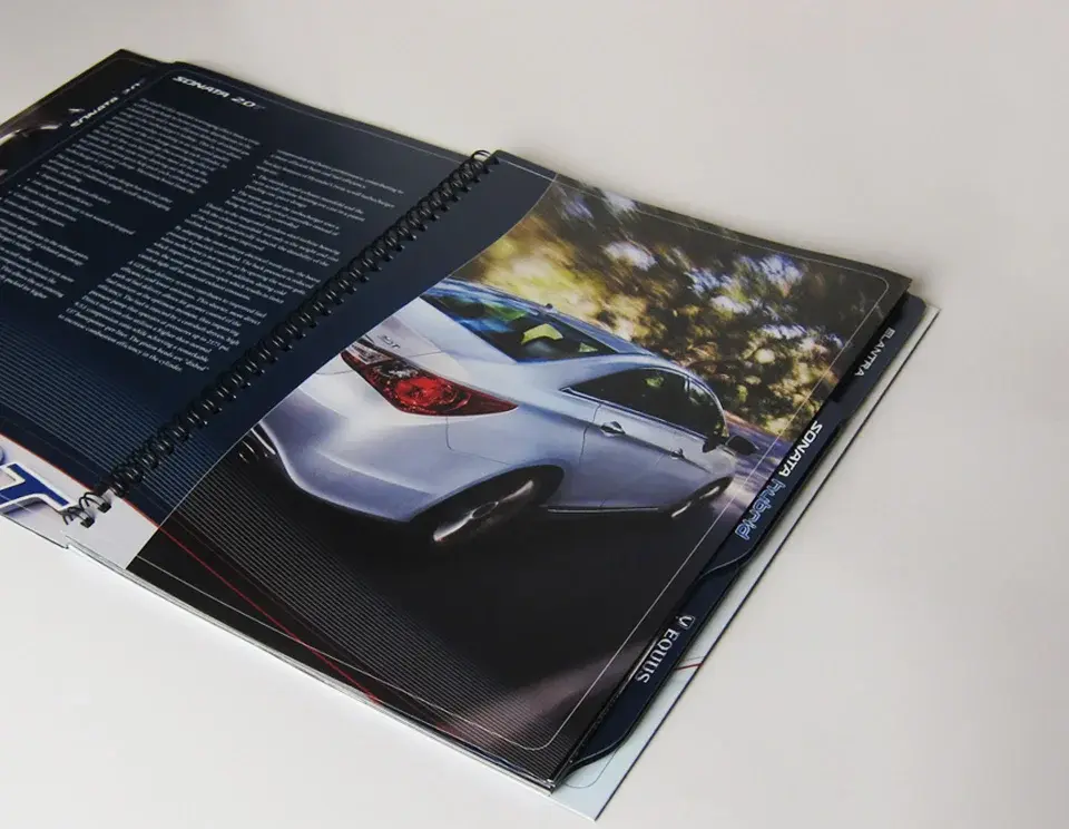
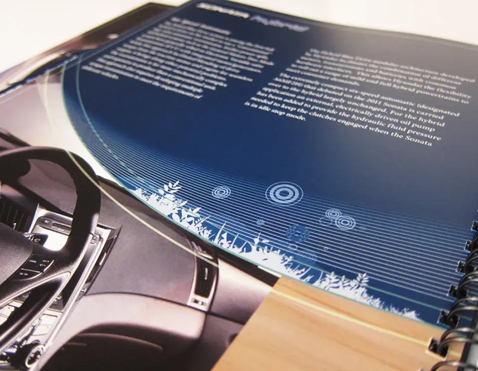
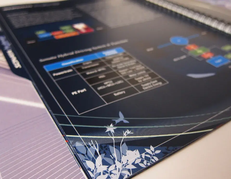
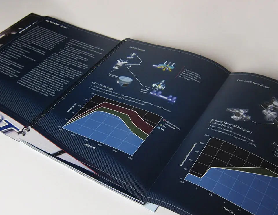
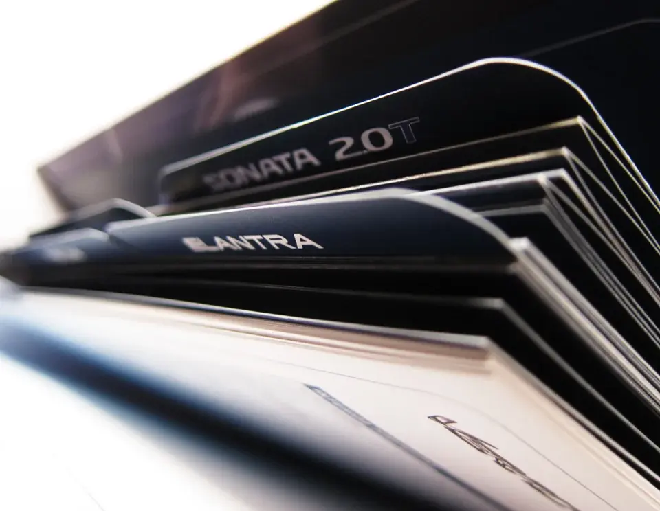
A comprehensive automotive media guide using disciplined information architecture to make a large model and corporate-content library fast to navigate.
A large volume of model and company information needed to be easy for media audiences to navigate.
Build a disciplined editorial grid, strong section architecture, and a clear tabbed information system.
A comprehensive media guide designed as an efficient reference tool and polished brand artifact.
Dense information became a structured, usable publication with a confident automotive character.
Kawasaki
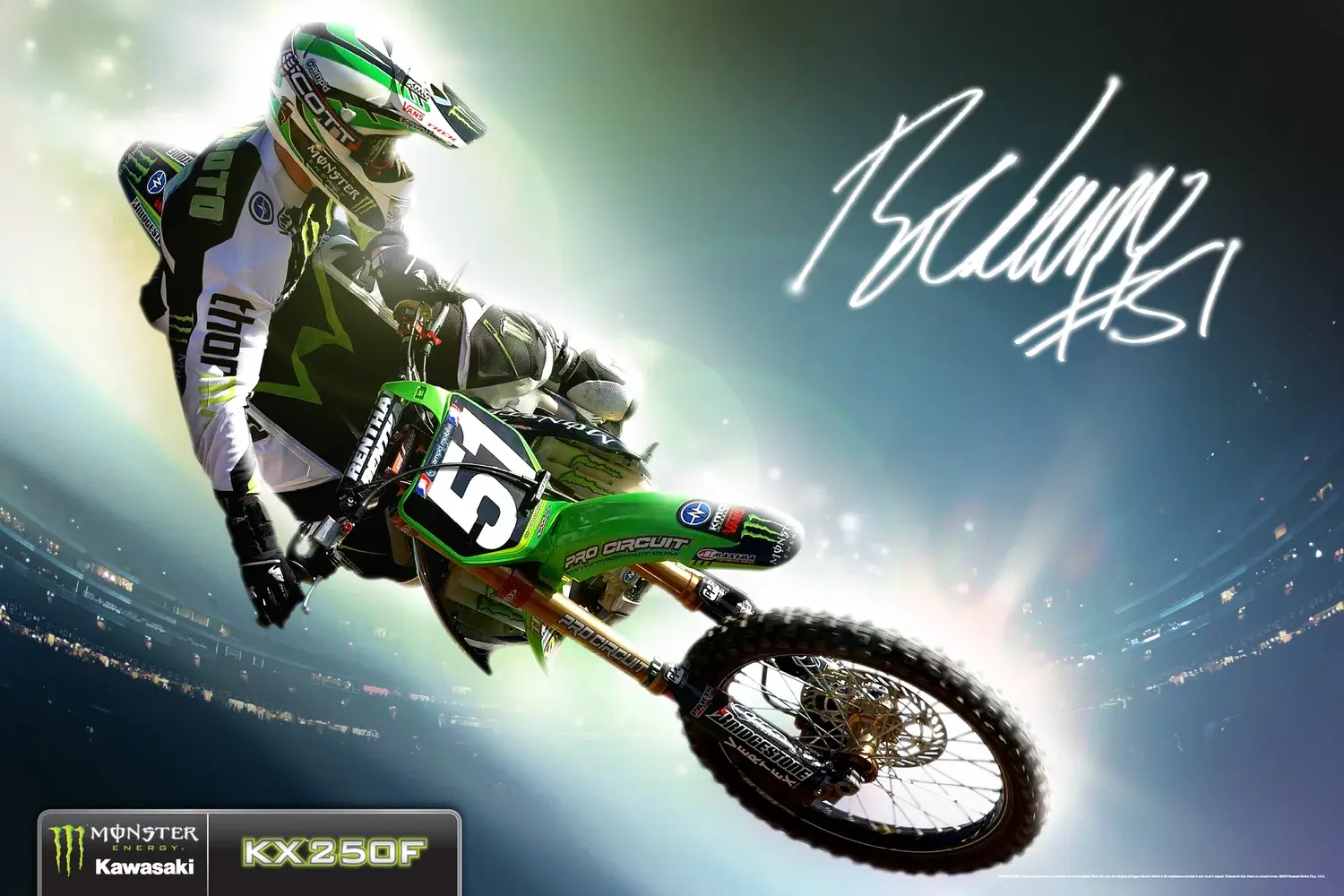
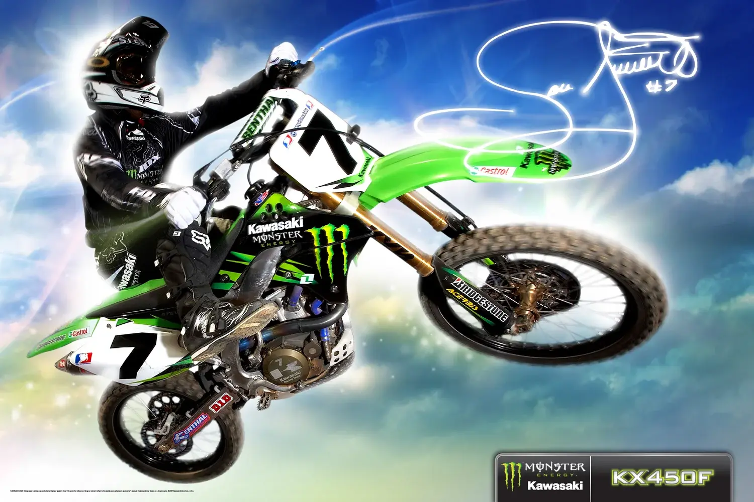
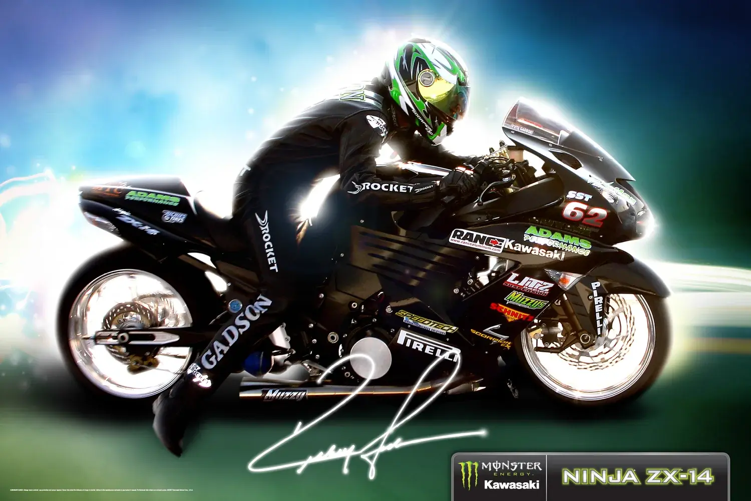
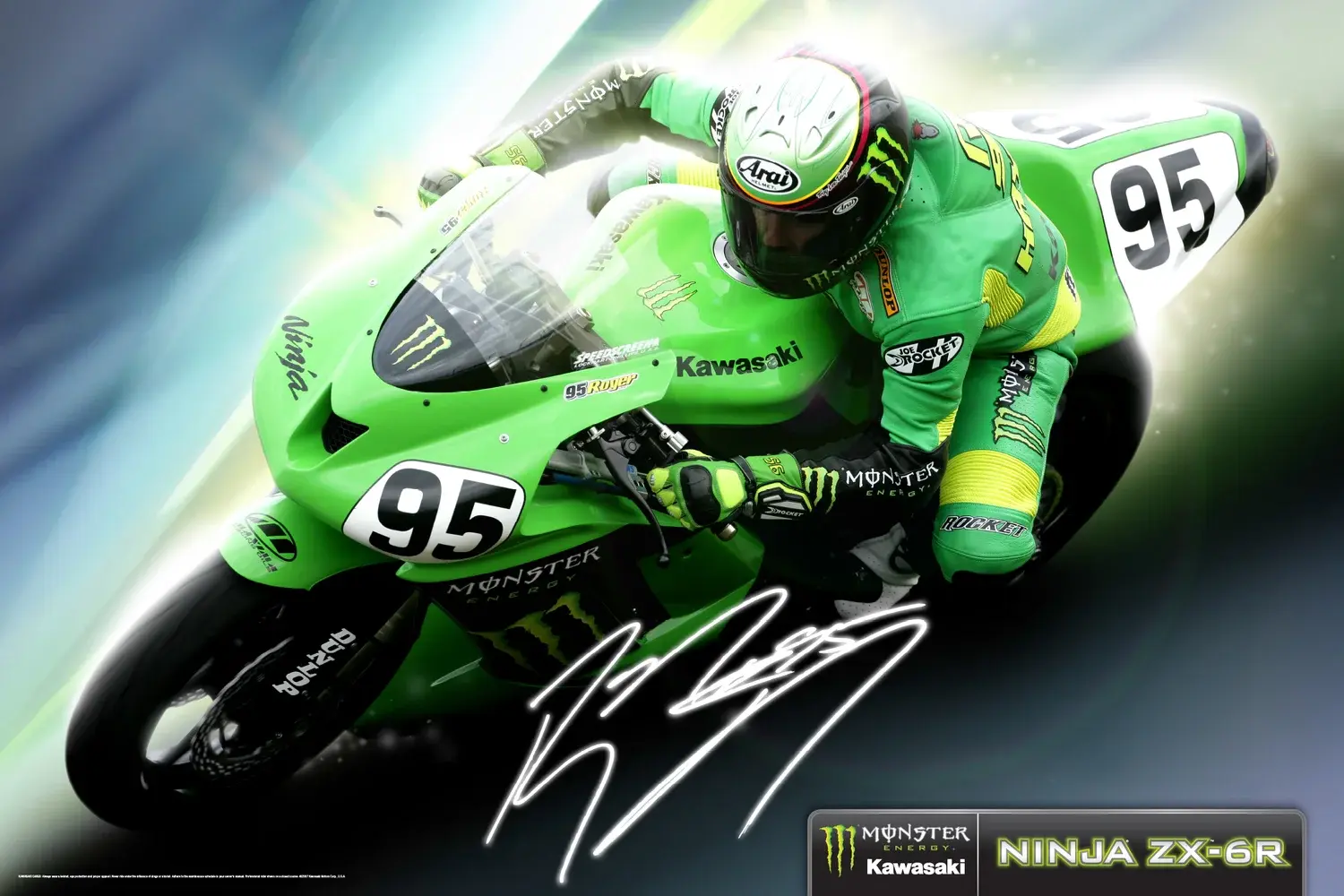
A collectible motorsports poster series pairing individual rider personalities with a unified, high-energy Team Kawasaki campaign language.
A racing team campaign needed to communicate speed, personality, and competitive energy at a glance.
Combine dramatic athlete imagery, aggressive composition, and a tightly controlled green-and-black visual language.
A collectible poster series that gives each rider an individual moment within one unified campaign.
High-impact team creative with a clear family resemblance and strong motorsports presence.
Southwest Airlines
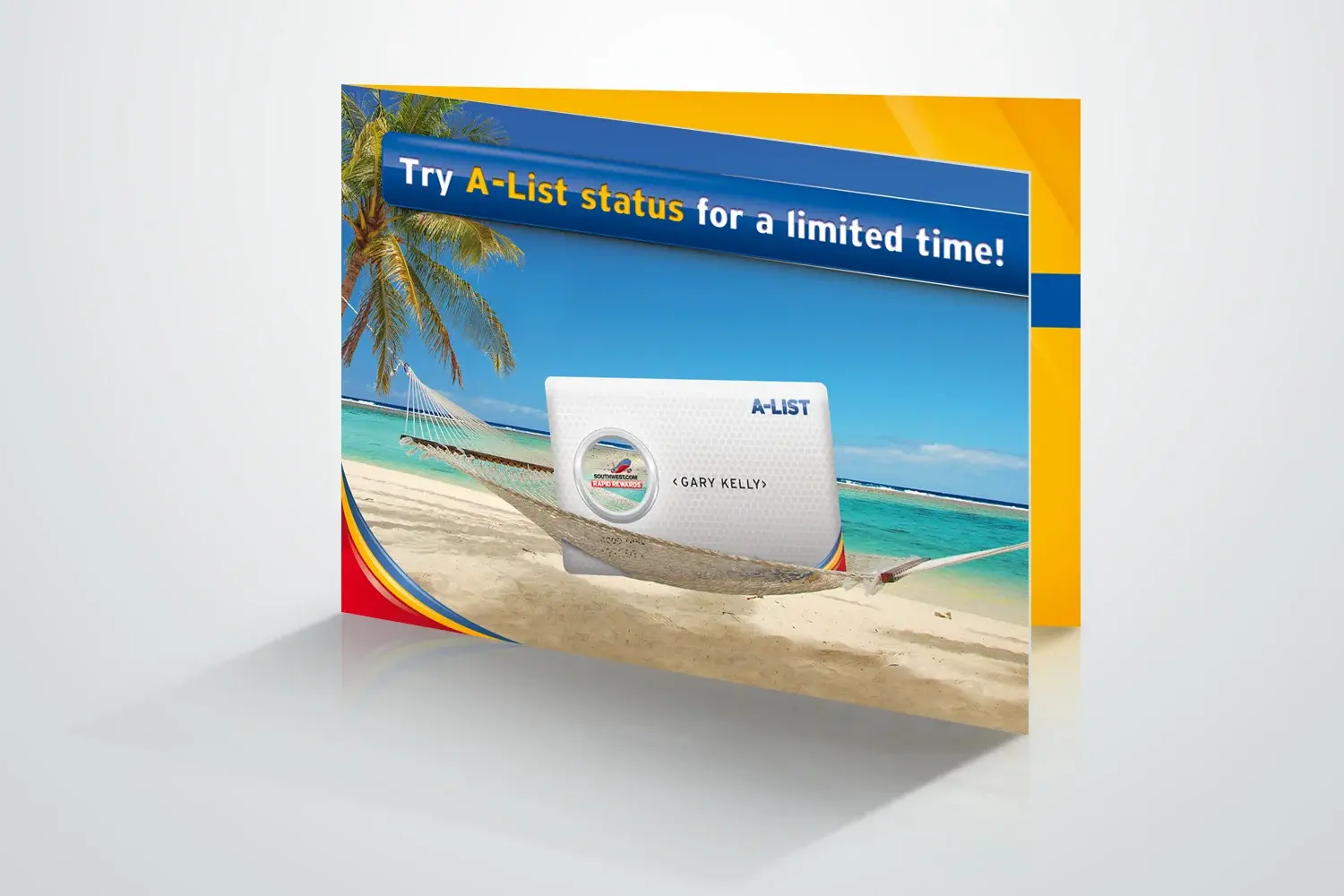
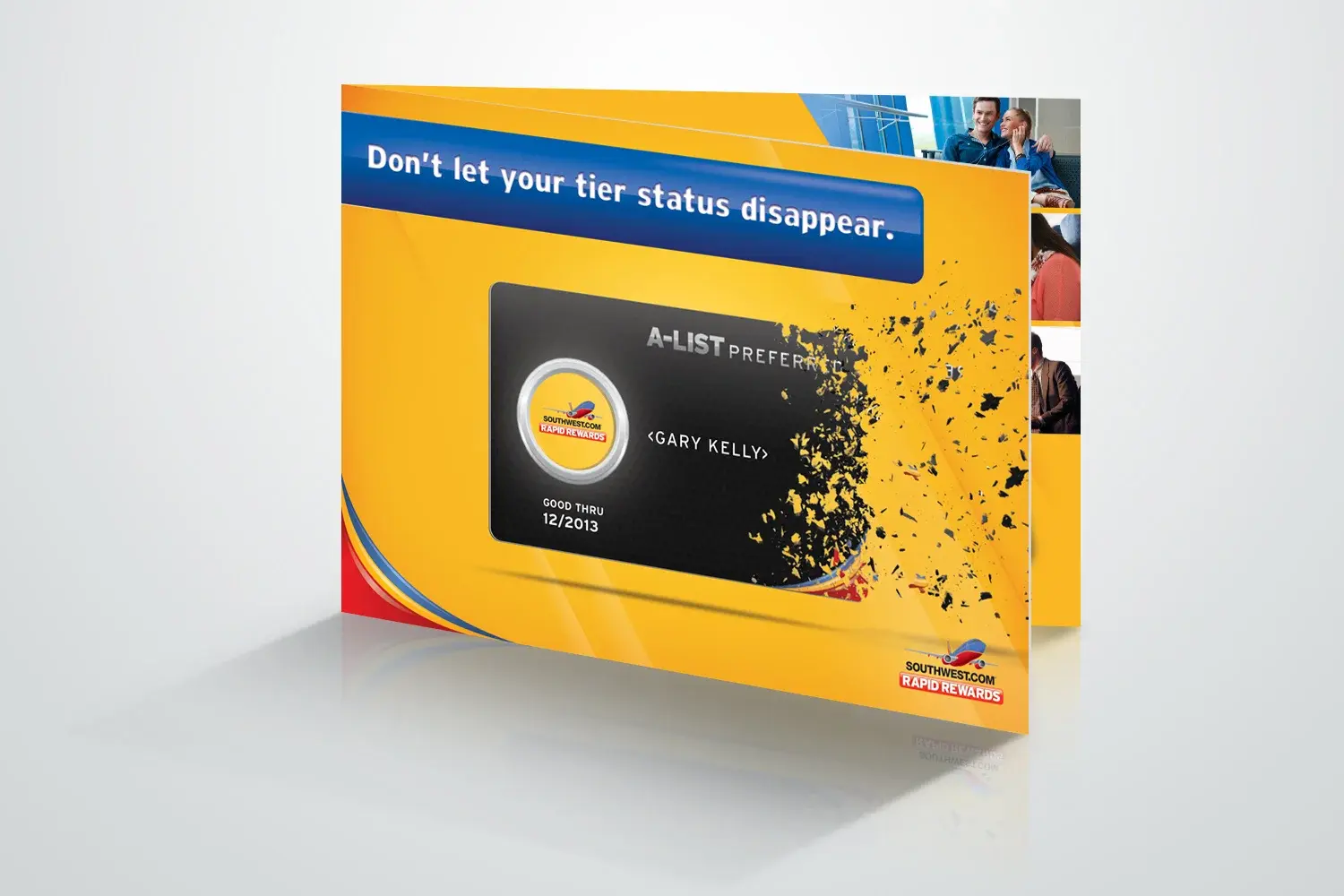
A dimensional direct-mail experience that made loyalty-tier progression and member value immediately understandable and tangible.
A loyalty-tier message needed to feel immediate, valuable, and easy to understand in a crowded mailbox.
Lead with member value, simplify the hierarchy, and use energetic brand cues to pull readers through the offer.
A dimensional direct-mail system communicating tier progression and program benefits.
A focused loyalty communication that made the next level feel tangible and attainable.
Southwest Airlines
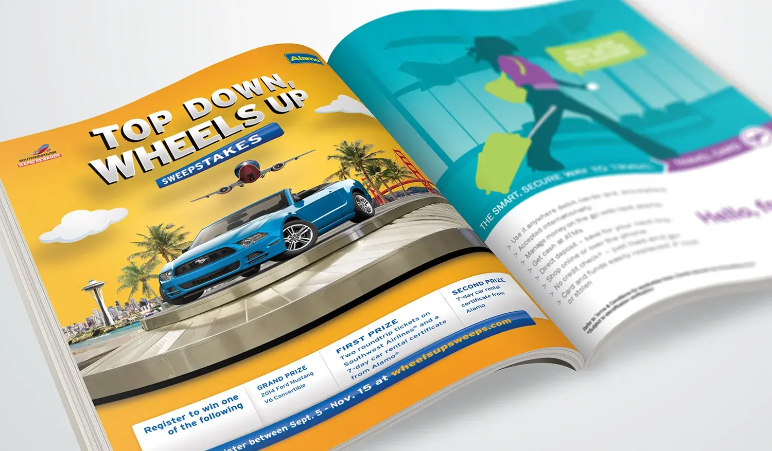
A co-branded travel campaign aligning Southwest Rapid Rewards and Alamo around one simple, customer-centered benefit.
Two travel brands needed one seamless offer without diluting either identity.
Find a shared visual language around travel freedom, then establish a direct and readable offer hierarchy.
A co-branded Rapid Rewards and Alamo campaign built around a simple travel benefit.
A balanced partnership execution that connected the brands through one clear customer proposition.

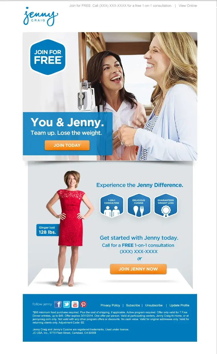
Consumer + Service Brands
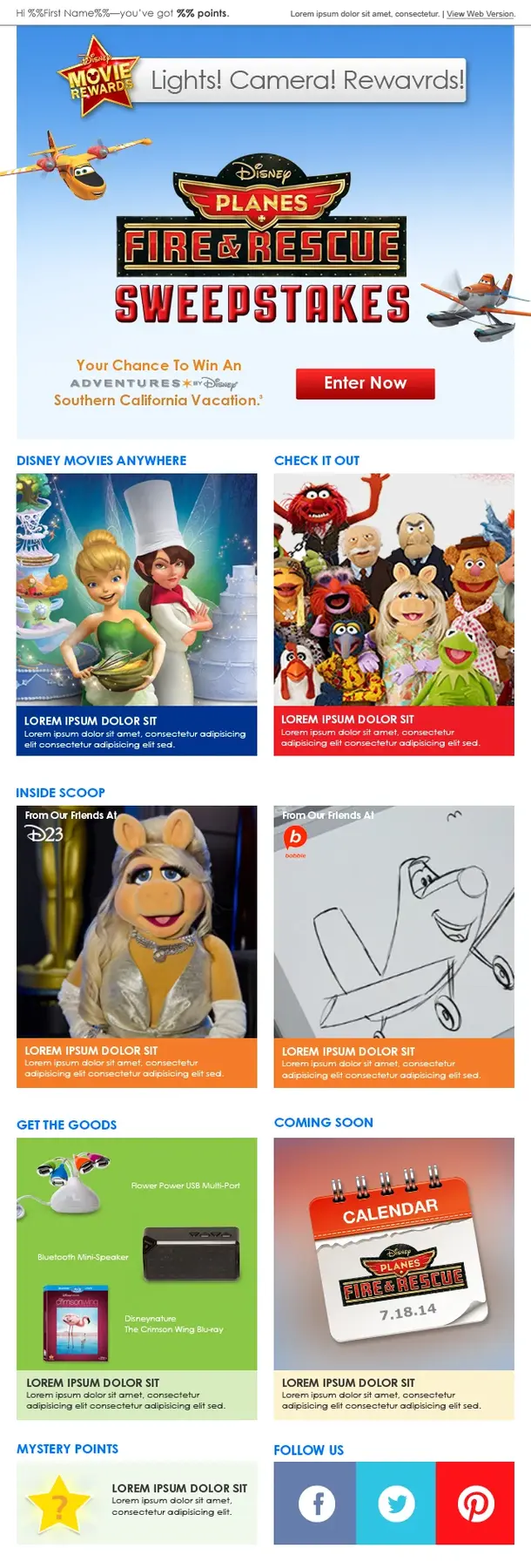
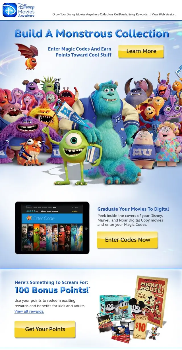
Conversion-minded CRM and promotional email systems built to clarify varied offers, earn attention quickly, and drive one focused action.
Promotional messages had to earn attention quickly while preserving brand clarity across varied offers.
Organize each email around a single action, using strong visual entry points and concise benefit hierarchy.
A collection of conversion-minded email designs adaptable to multiple campaigns and audiences.
A clearer bridge between campaign message, offer, and click-through action.
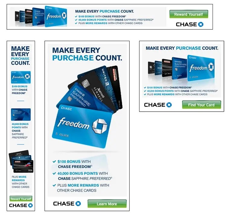
Chase
Compact motion-led digital advertising that translated complex card offers into fast, brand-consistent message sequences.
Product benefits and promotional offers had to land within compact, fast-moving banner formats.
Reduce each message to its most persuasive sequence and build a visual hierarchy that survives at small sizes.
A set of digital banner concepts balancing offer clarity, brand standards, and motion-led attention.
Focused digital units designed to communicate quickly across high-volume placements.
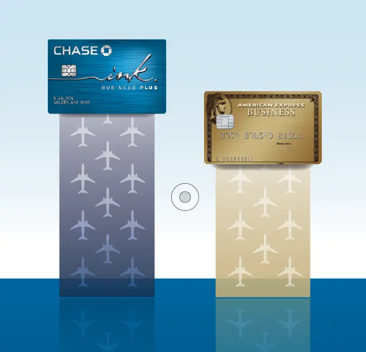
Chase Ink
Five animated banner concepts for Chase Ink business credit cards, communicating a simple way to earn rewards on everyday business purchases.
Chase Ink offered cash back on every purchase, but a crowded competitive category made it difficult for the benefit to stand out.
Focused on clarity and visual differentiation, using concise messaging and Flash animation to make the reward mechanics engaging and immediately understandable.
Five cohesive banner concepts—three for Ink Plus and two for Ink Cash—each distinguishing the rewards message while maintaining one campaign identity.
A flexible digital system that positioned Ink as a smart, simple rewards choice across high-volume placements.
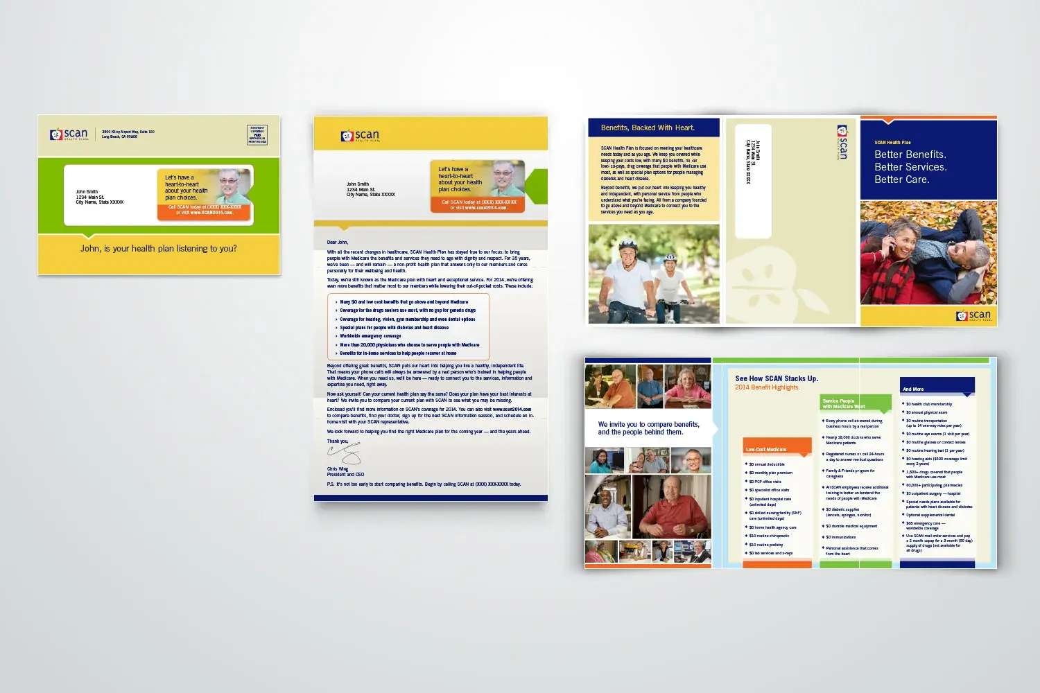
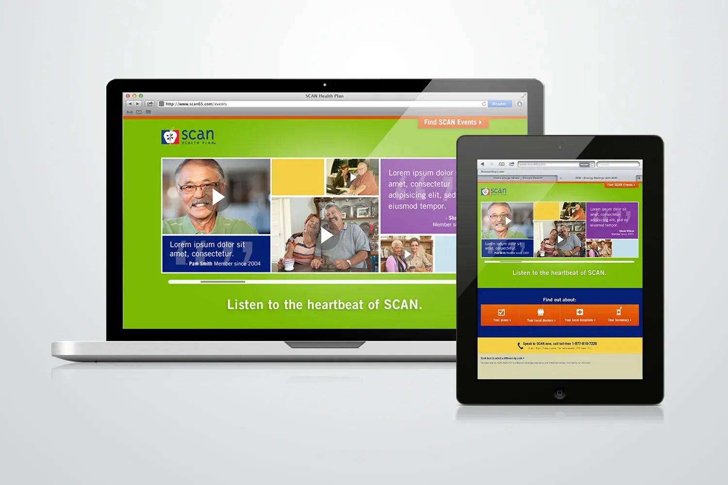
SCAN Health Plan
An approachable enrollment journey connecting human, audience-relevant print communication to a focused digital response path.
Enrollment information needed to feel more human and approachable without losing clarity or trust.
Pair warm, audience-relevant storytelling with a simplified response path across channels.
A coordinated print and landing-page experience designed around enrollment confidence.
A consistent member journey from awareness material to focused digital response.
Southern California Edison
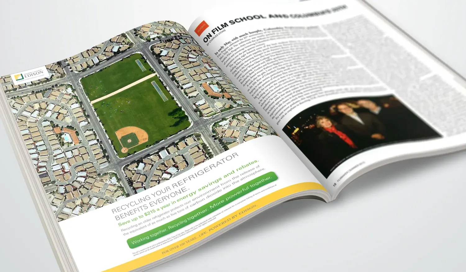
A memorable direct-response campaign that turned a technical appliance-recycling incentive into a simple, benefit-forward story.
A practical appliance-recycling incentive needed a simple idea strong enough to interrupt and explain.
Turn the old refrigerator into the visual story, then make the value exchange immediate.
A direct-response campaign centered on a memorable, benefit-forward visual concept.
An otherwise technical utility message became accessible, visual, and action-oriented.
Ink Agency
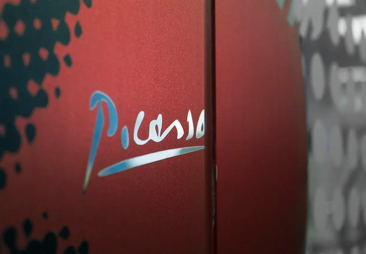
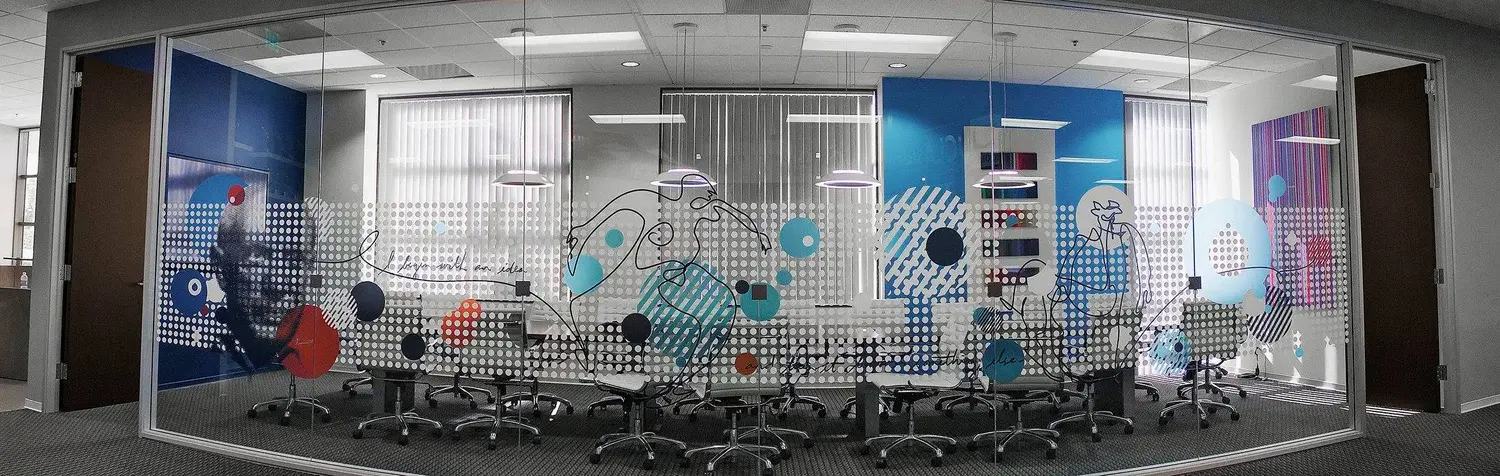
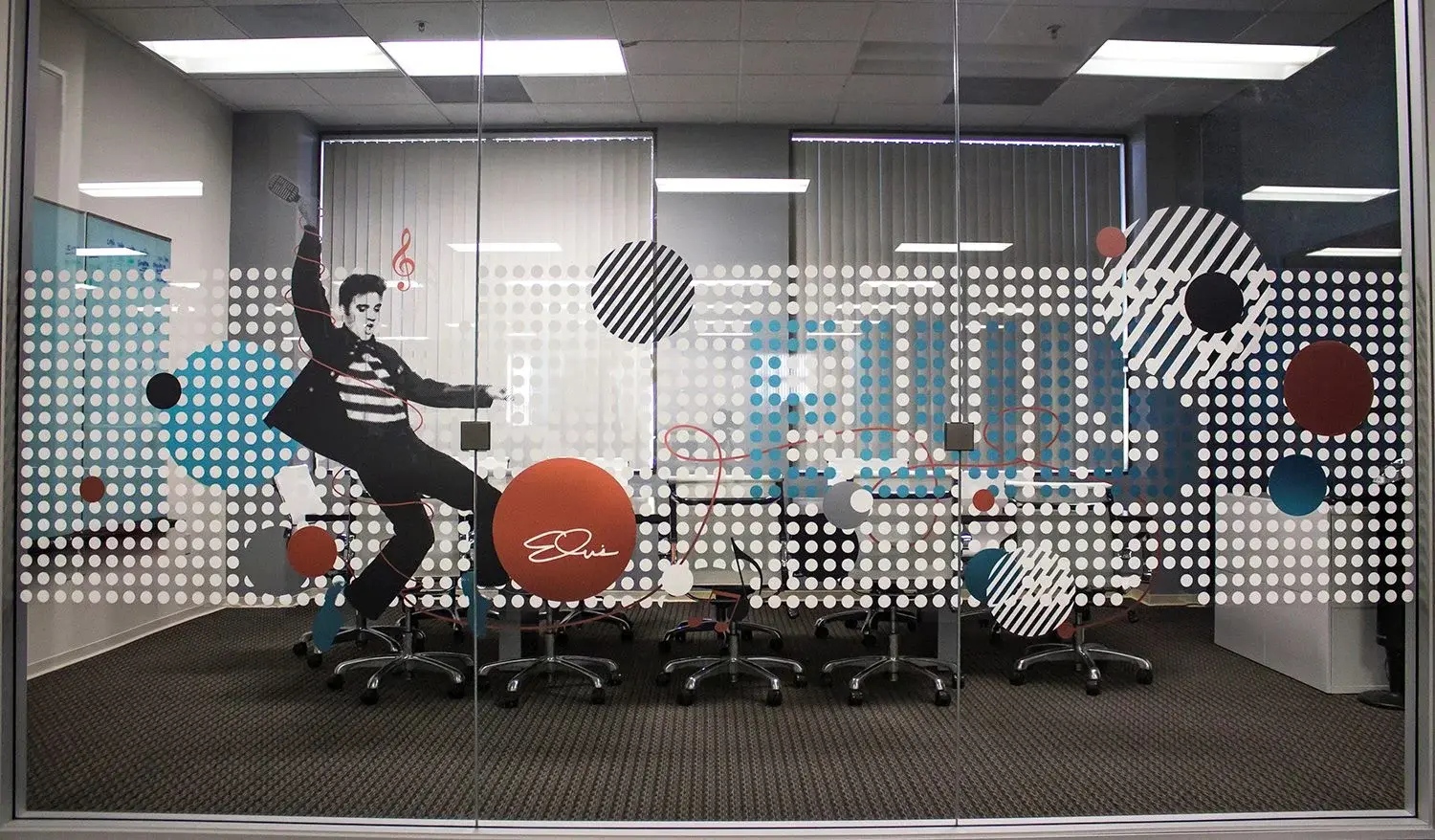
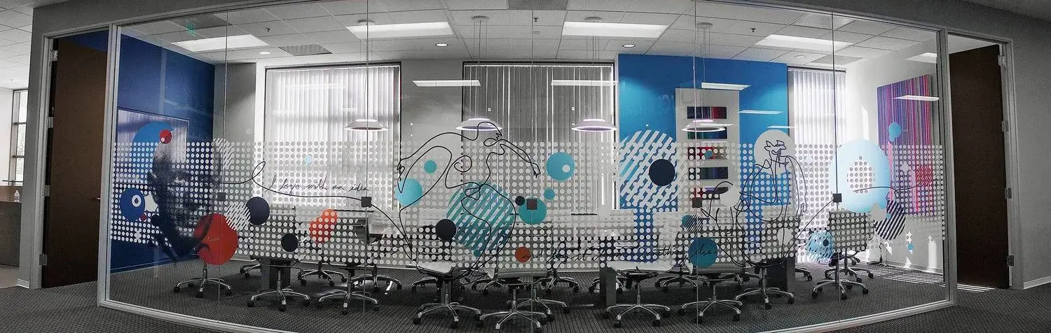
Large-scale environmental graphics that transformed a blank office into a visible expression of agency voice, energy, and culture.
A new office needed to express the agency’s personality and make blank space feel culturally specific.
Treat walls and shared spaces as editorial canvases for the agency’s voice, energy, and visual identity.
A series of large-scale environmental graphics integrated throughout the workspace.
A more distinctive workplace that made brand culture visible to employees and visitors.
Independent + Small Business
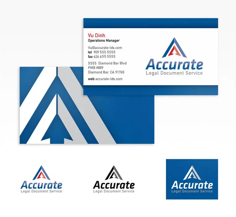
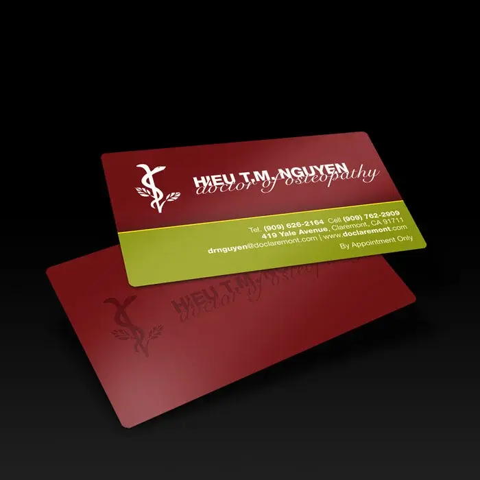
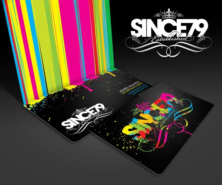
A cross-category collection of identity systems built around one memorable idea, extended through marks, typography, and practical applications.
Different ventures needed compact identities capable of signaling personality and purpose immediately.
Find one memorable idea for each brand, then extend it through typography, marks, and practical applications.
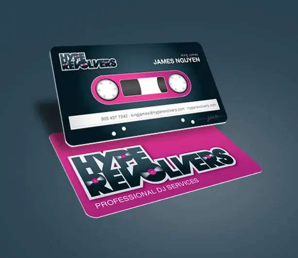
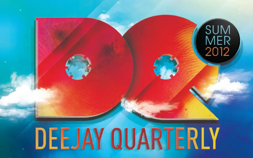
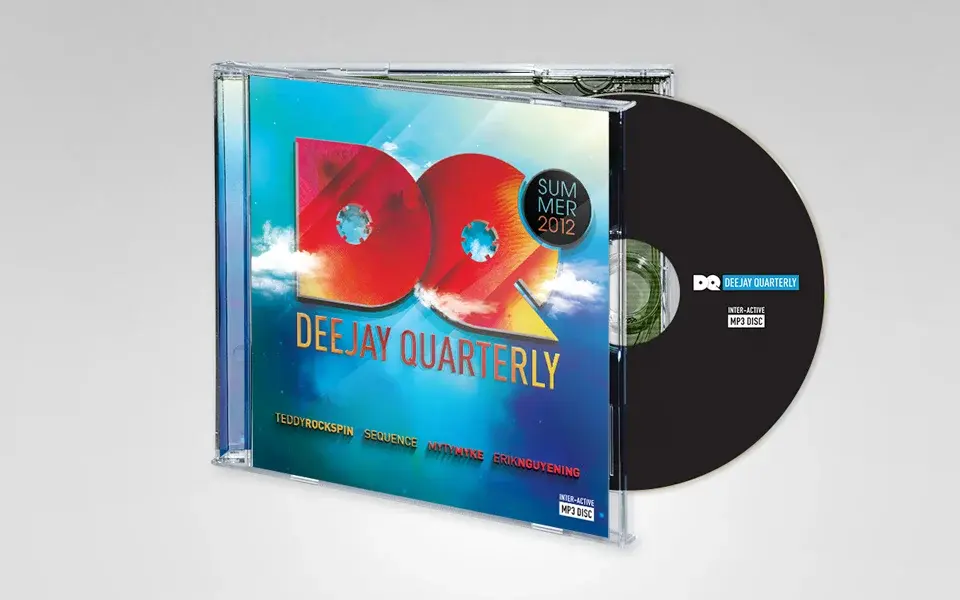
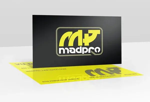
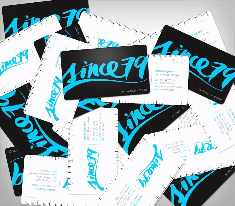
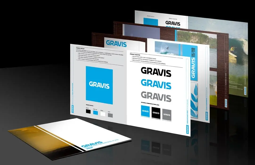
A collection of identity systems, marks, and business-card applications across varied categories.
Distinctive visual foundations designed to remain recognizable across everyday brand touchpoints.
Various
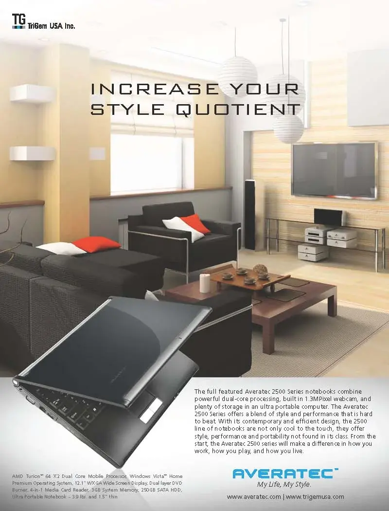
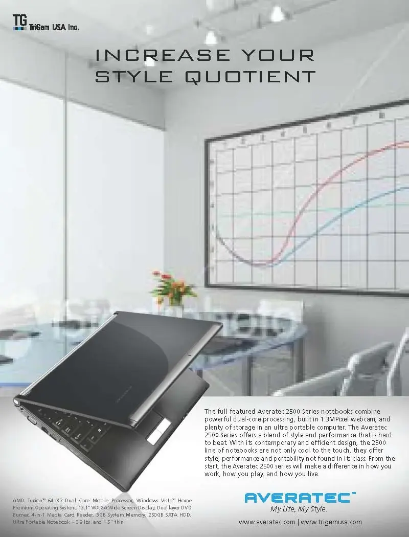
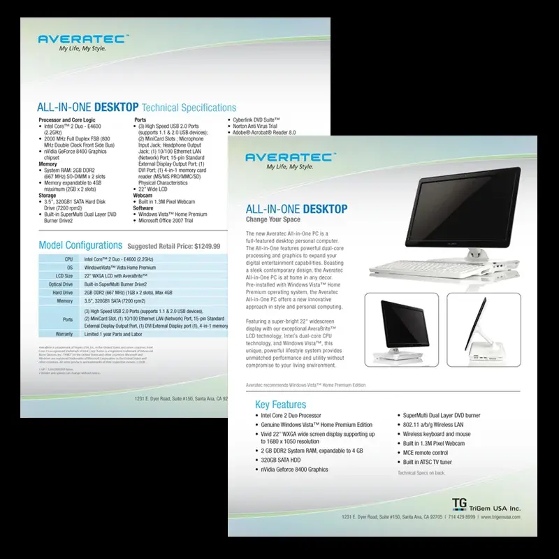
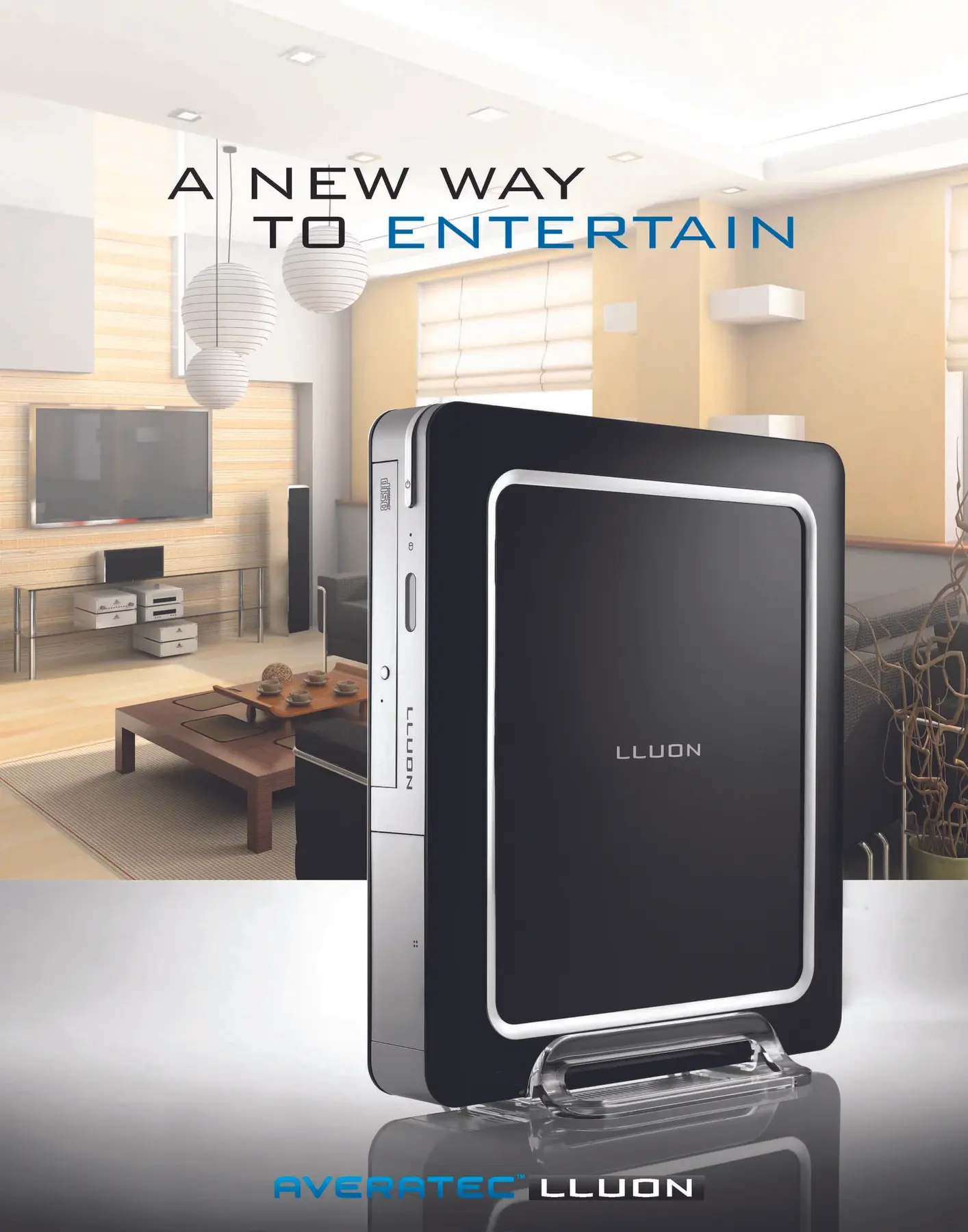
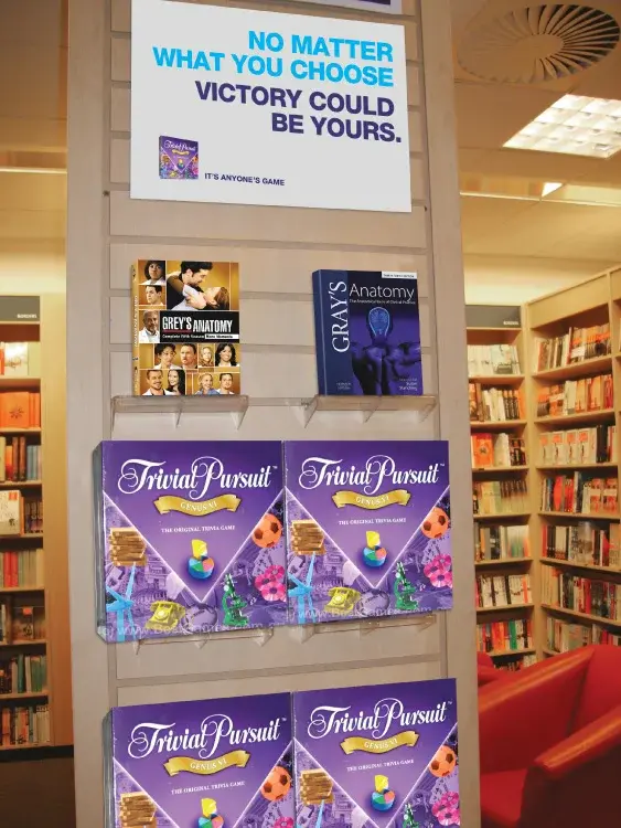
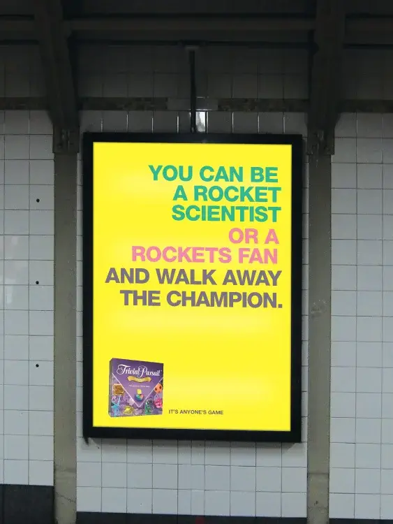
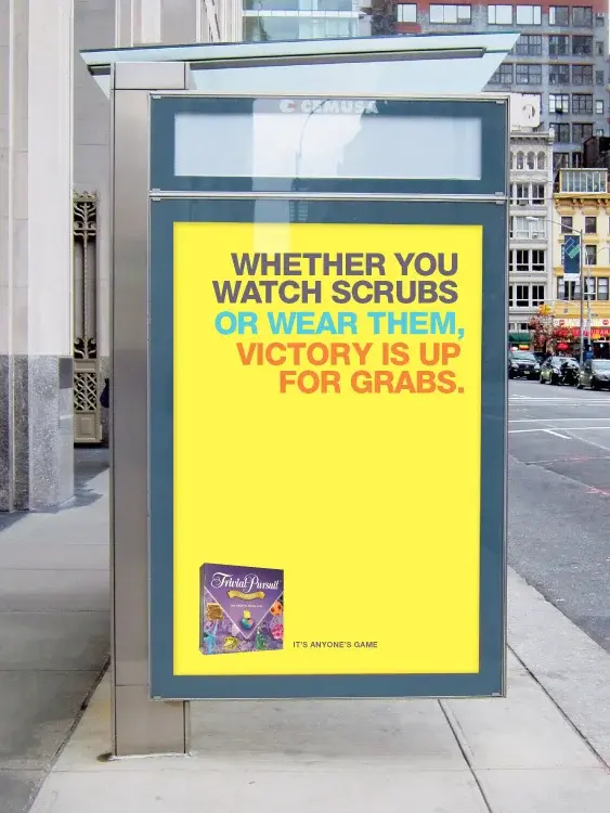
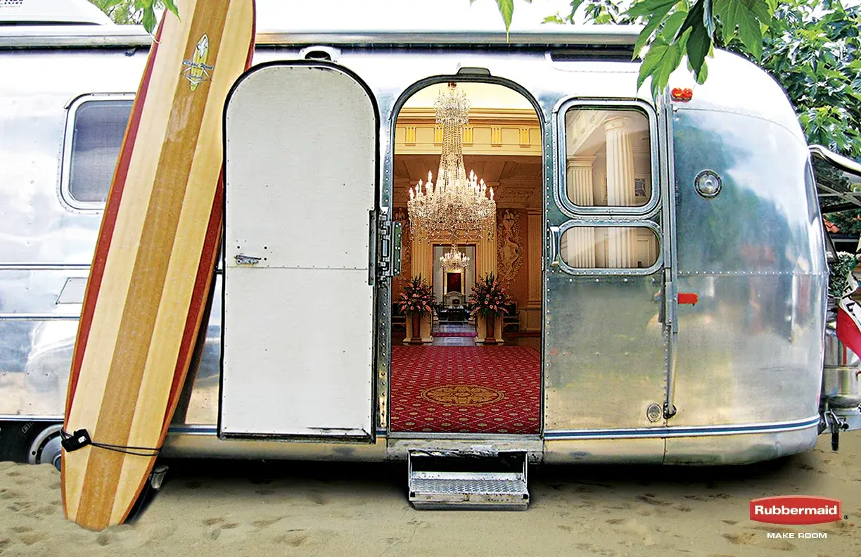
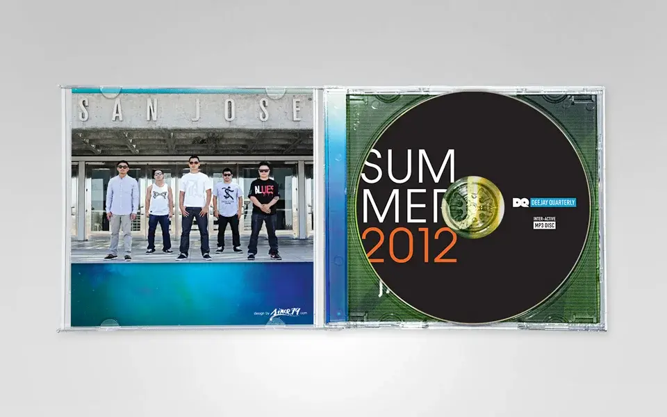
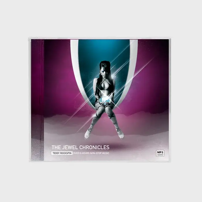
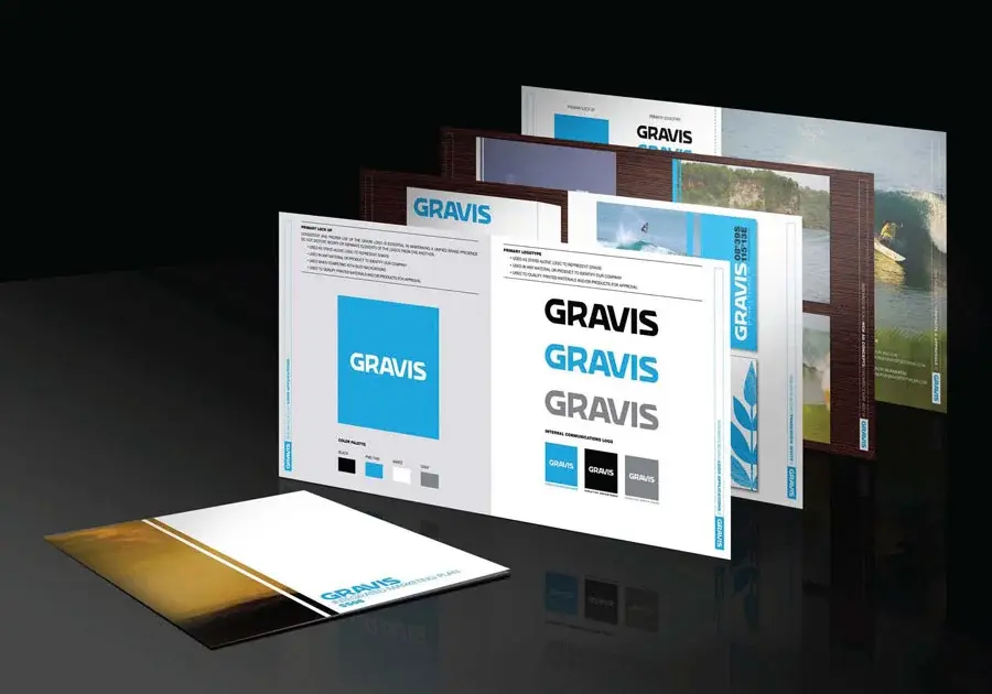
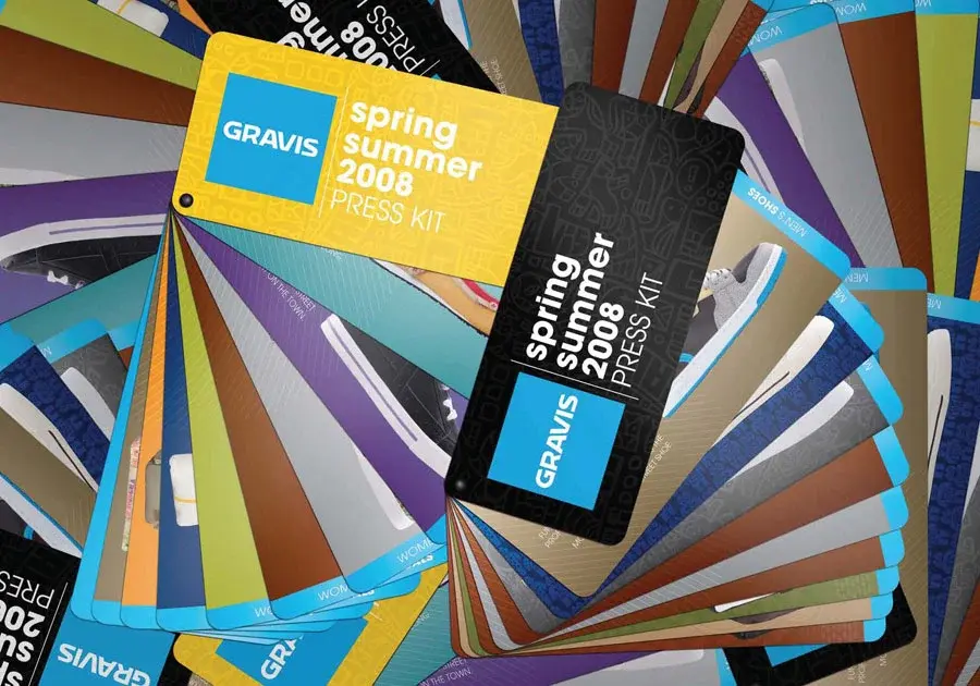
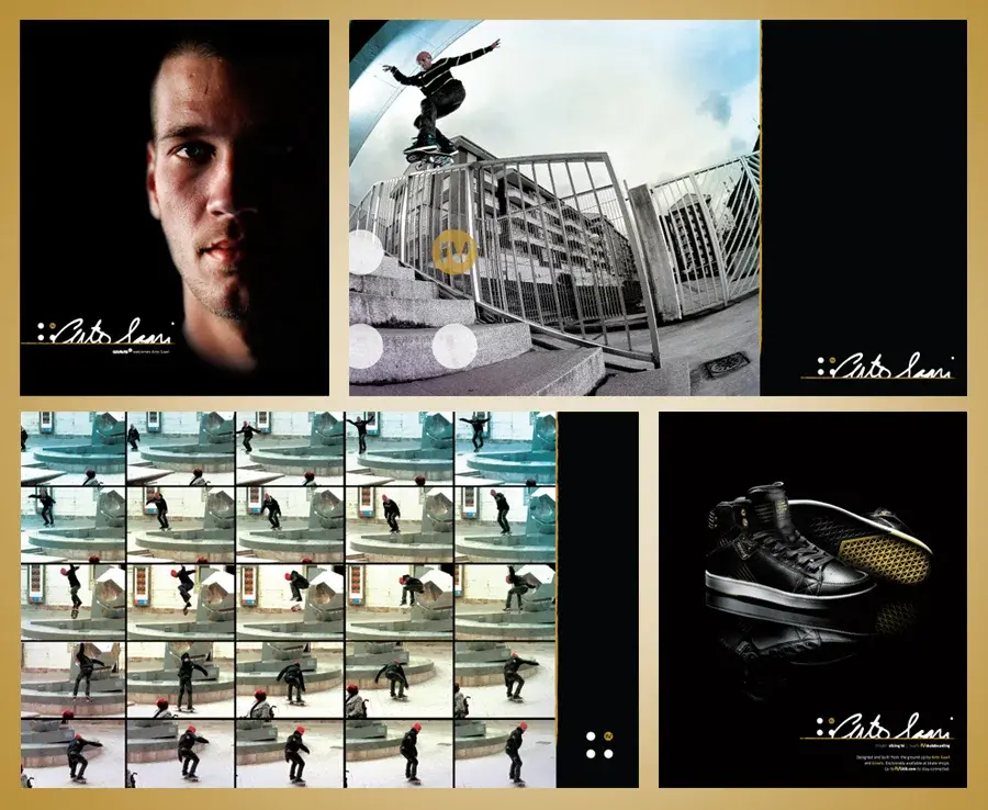
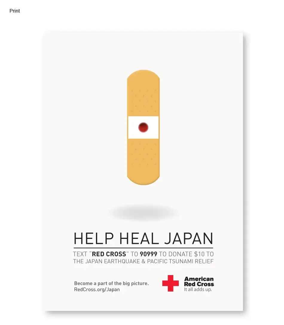
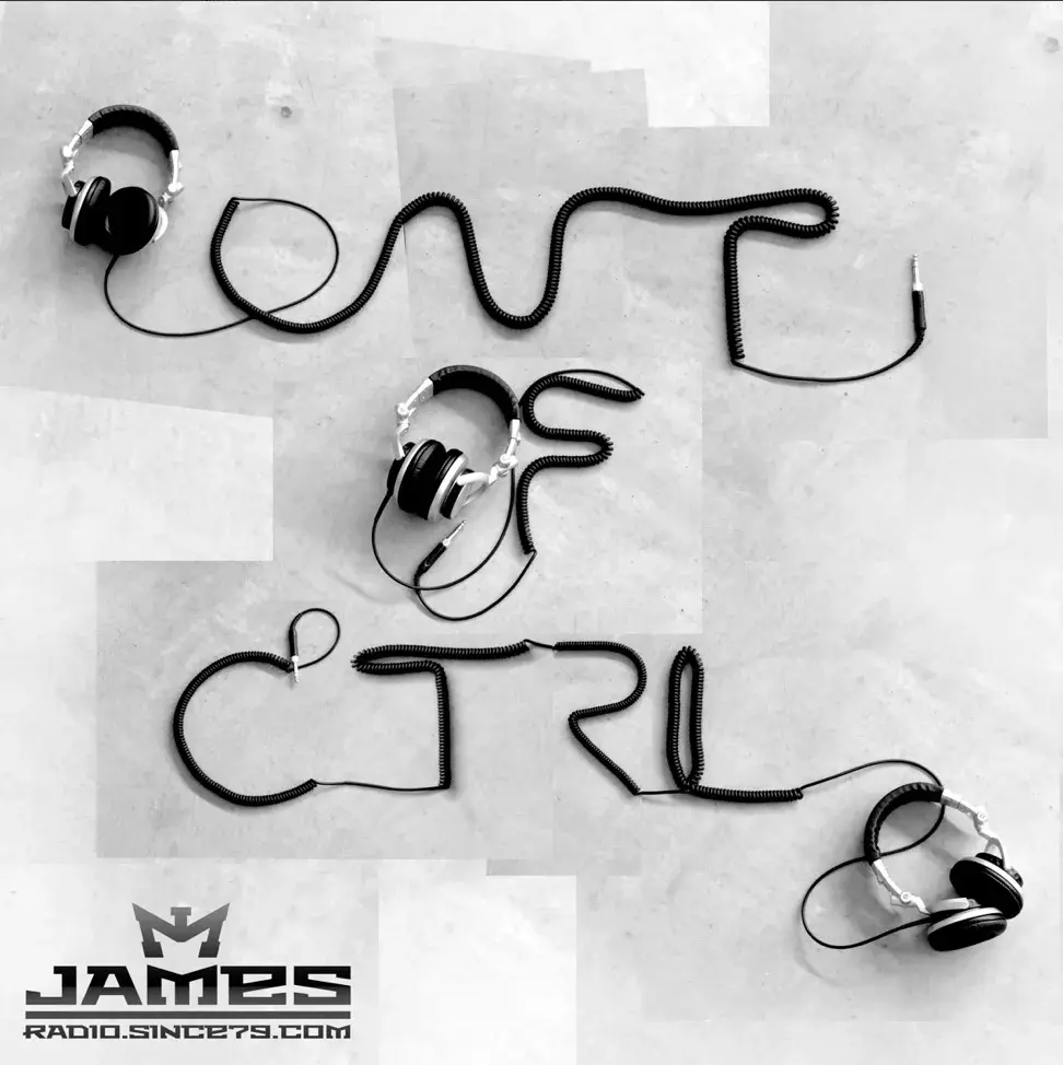
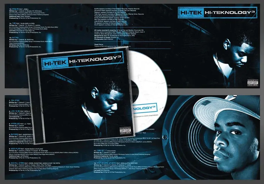
A broad archive demonstrating range across campaign concepts, editorial design, digital production, and polished execution without losing strategic intent.
A wide range of assignments called for fast shifts in medium, audience, and visual voice.
Start with the communication goal, then choose the craft, composition, and production method that serves it best.
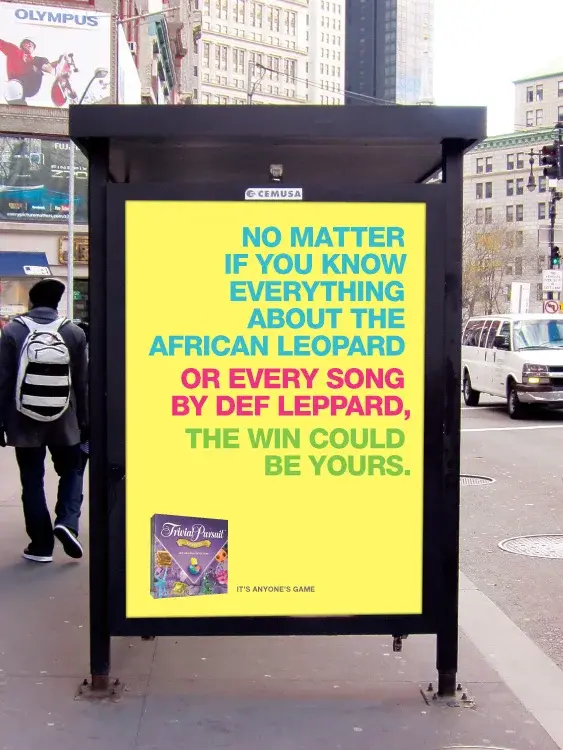
A broad archive of campaign concepts, editorial pieces, digital work, and polished production design.
A body of work showing versatility without sacrificing conceptual thinking or executional care.




About James
I’m James Nguyen, a multidisciplinary creative director and designer with roots in entertainment advertising and deep experience across integrated campaigns, digital products, packaging, and performance creative.
I partner with teams to clarify the problem, find the sharpest idea, and execute it with the craft needed to perform in the real world.